ホームページ制作|札幌
ホームページ制作|札幌
北海道札幌市北区北6条西6丁目2-1朝日プラザ偕楽園506号室
営業時間 7:00-24:00 TEL/FAX 011-768-8116
代表:グレン チャールズ ロウ
29 Online (オンライン中(15ゲスト Guests 14検索ボート Bots, )

CSS, WordPress, Contact Form 7, Email, Media Call, Larger, Smaller

If you are using WordPress it is easy to change the padding based on the width of the screen.

Add the following CSS code below the the CSS part of the customize area.

@media (max-width:1200px) {/below 1200/.wpcf7-form{padding:15px}}

@media (min-width:1200px) {/above 1200/.wpcf7-form{padding:0px}}

This first line of code will add 15 pixels of padding when the email form is smaller than 1,200 pixels. The second line of code will set the padding to 0 pixels when the screen is more than 1,200 pixels in width.

CSS, WordPress, Contact Form 7, Email Form, Media Call, Larger Than, Smaller Than

How to Export and Import Database in phpMyAdmin

INSTRUCTIONS

Method 1 – phpMyAdmin

Export

  1. Select your database from the list on the left.
  2. Click on “Export” from the top set of tabs.
  3. Select the tables from the list that you would like to back up. If you want to back up the entire database, click “Select All.”
  4. Make sure both the “Structure” and “Data” boxes are selected on the right. They should be, by default.In the Structure section, check the “Add DROP TABLE / DROP VIEW” box if you want this export to be able to replace existing tables of the same name. If you want to merge this backup with another database, do not select this.
  5. Check the “Save as file” box. Also select a compression option (such as “gzipped”) if you want to compress the backup before downloading it from the server.
  6. Click the “Go” button, and, at the prompt, save the file to your local computer.

Import

  1. Make sure the database you need has already been created. If it has not, please first create the database:

    CAUTION:

    If you import a backup file to a database that already has content, it will replace the existing content.

  2. In phpMyAdmin, select your database from the list on the left.
  3. Click on “Import” from the top set of tabs.
  4. Click on the “Browse” button next to “Location of the text file.”
  5. Browse to your local SQL file and click “Open.” If it is a zipped file, please unzip the file first.
  6. Click the “Go” button at the bottom. Wait while your database imports. Depending on the size, this can take a few minutes.

    You should get a message like this:Import has been successfully finished, X queries executed.

    If you instead receive an error, please try the command line method below.

wp-includes – class-wp-admin-bar.php

/wp-includes/class-wp-admin-bar.php

Line 417

<div class=”quicklinks” id=”wp-toolbar” role=”navigation” aria-label=”<?php esc_attr_e( ‘Toolbar’ ); ?>” tabindex=”0″>

Delete tabindex=”0″ from that code.


Does Illustrator get stuck while scrolling through fonts? Here’s a fix!

Does Illustrator get stuck while scrolling through fonts? Here’s a fix!

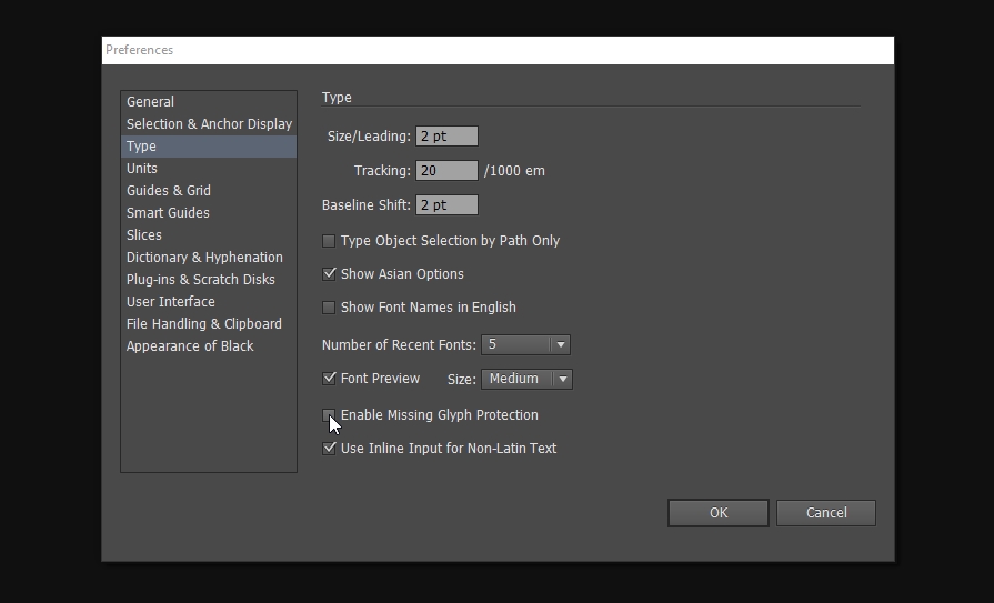
Enable Missing Glyph Protection - CS6 -  Illustrator gets stuck when scrolling through fonts

For the longest time if I select some text and start scrolling through fonts to find one that worked well, it would get stuck on certain fonts while scrolling and had to manually skip a couple fonts so I can keep browsing through only the get stuck by another. I decided that I’ve had enough of that and decided to search for a solution.

Surprisingly, I couldn’t find many pages discussing this issue but I eventually found a solution.

Here is the fix:

  1. Go to Edit > Preferences (or Ctrl/Cmd + K)
  1. Select Type
  1. Uncheck Enable Missing Glyph Protection

Ever since unchecking that setting, AI hasn’t gotten stuck once. Hope this helps someone.

Source: https://www.tommywhite.com/tips-and-tricks/illustrator-gets-stuck-or-jumps-to-the-bottom-of-the-list-when-scrolling-through-fonts/

エゾプロダクト Ezoproduct Inc.

エゾプロダクト – Ezoproduct Inc.

エゾプロダクト

http://ezopro.com/


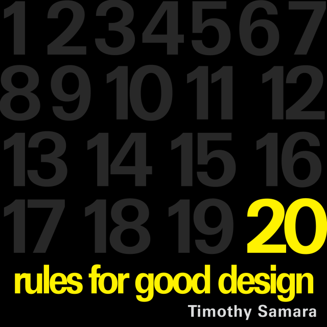
20 Rules for Good Design

20 Rules for Good Design


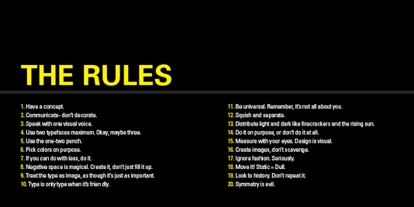
20 Rules for Good Design – Part 1 to 10


20 Rules for Good Design from Timothy Samara’s Book, “Graphic Design Elements.”

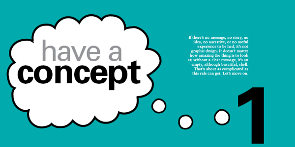
1 – HAVE A CONCEPT.

For good design, you need to begin with an idea. It may be very simple or neutral – “Itʼs important to organise this information to be easily navigable” – or it may be creatively contrived – “These biscuits will seem more delicious if they appear to be made by elves.” No idea = No design.

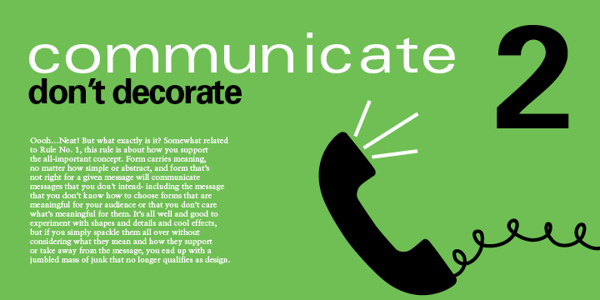
2 – COMMUNICATE  – DON’T DECORATE.

Form. it is often said (not often enough, lately) follows function. This means two things. First – every dot, line, texture, shape, colour, and image should be related to the concept that must be conveyed (rule No. 1). Second, each of these forms should add to the concept. If the form is there solely because you think itʼs cool, you should probably get rid of it.

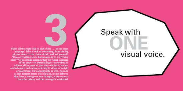
3 – SPEAK WITH ONE VISUAL VOICE.

All the parts of a project really should be recognisably related to each other on a visual level. That is, they must share some similar qualities in order to appear part of the same unified message.

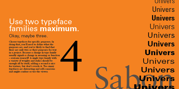
4 – USE TWO TYPEFACES – MAX.

Ok – maybe three…. no just two, typefaces only get you so far, even stylistically. Itʼs what you DO with the type that really says something. For hardcore, hierarchical concerns, one type family with a range of weights and widths should be enough.

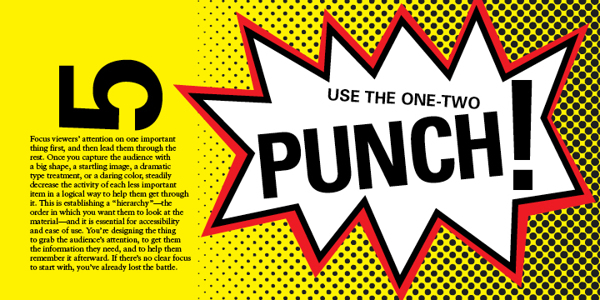
5 – SHOW ONE THING FIRST.

Hierarchy again…. Give visual emphasis to one item to grab the viewer’s attention. Then direct them – through a progression of size, weight, and colour changes, and so on – down the line of importance items or instructions. If they have to figure out what to look at first, they’ll get confused and leave or just throw what ever the item of communication is in the bin.

6 – PICK COLOURS FOR A PURPOSE.

As subjective as colour perception is, it’s shouldn’t be all guesswork. Colours mean things culturally, and colours have optical relationships to each other. Use these “factual” aspects to choose and combine colours in a meaningful way – and in an optically dynamic way.

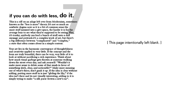
7 – IF YOU CAN DO WITH LESS, DO SO.

This is another way of saying “Less is more.” It’s about being economical: Try to show only what is necessary. If “necessary” can be pared down a bit, too, that’s a good thing. Think about how many messages, how many resources, how many annoying blobs of information the average viewer has to deal with on a regular basis (never mind the landfill). Now, design accordingly.

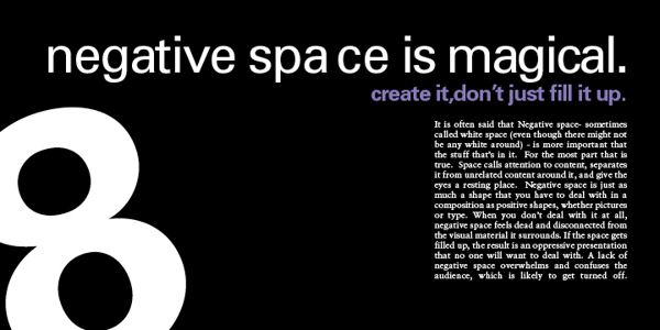
8 – NEGATIVE SPACE IS IMPORTANT: CREATE IT, DON’T FILL IT UP!

Despite the fact that the space in a format around the shapes and pictures and text is apparently empty, it’s really a shape unto itself. Consider it as carefully as you would anything that you plop into it. The better integrated the negative space and the more interesting it is, the stronger the composition.

9 – TREAT TYPE LIKE IMAGE.

This is one of the most difficult rules to master. Type actually is an image, even though it looks like something else. It must be considered for its visual qualities, relative to other image material, to integrate it into compositions – even more so when there’s a lot of it.

10 – KEEP TYPE FRIENDLY.

If it’s illegible, it’s not type. If it’s illegible it’s not type. And if itʼs illegible, itʼs not type. Consider the audience – their assumed level of education, their schedule, and especially their age – when choosing styles and sizes. Written language exists to transmit information, and your client is paying you to transmit such information on their behalf. If the information canʼt be read – for any reason – itʼs no longer useful, and youʼre potentially out of a job.


20 Rules for Good Design – Part 11 to 20


11 – BE UNIVERSAL, IT’S NOT ABOUT YOU.

If youʼre interested in expressing your fetishes or psychoses, become a painter (fine art not wall) and work the gallery scene (seriously – it can pay alot better). The purpose of design is populist in nature: you re creating clear messages for other people. The more understandable the images you make, the better.

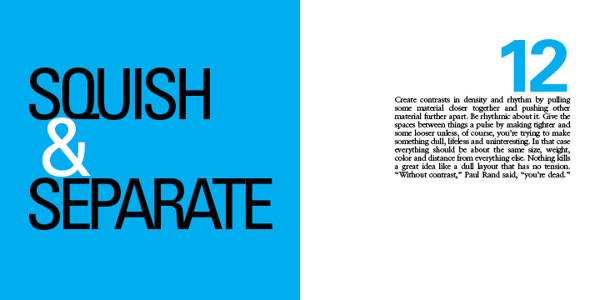
12 – CREATE RHYTHMS.

The antidote to visual boredom is tension, and there are two easy ways to achieve this antidote: The first is by constantly varying the sizes, weights, and spaces among visual elements so that they appear to be constantly shifting and moving. And….

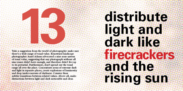
13- USE CONTRAST: DARK & LIGHT.

Radically vary the lightness and darkness in different areas of a composition, as well as the quality of dark and light values: Sharp and aggressive, fluid and murky, bold and clean…

14 – BE DECISIVE: DO OR DON’T.

Avoid being wishy-washy in arranging things. Visual elements should be clearly one thing or another, one way or another. Ambiguity can be useful, but even this should be on purpose, not a sloppy by-product of indecision.

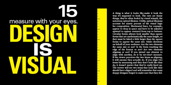
15 – MEASURE WITH YOUR EYES.

A majority of formal relationships play havoc with your eyes – for example, a solid dot and a square can appear to be different sizes if they are mathematically the same measure in height: circles appear to contract in a space because of their ill defined, endless contour.

All visual forms play off each other, so make them behave the way you want them to look like theyʼre behaving. Use your eyes: it usually will look better that way – and the more you do it the better you will get at it – like everything in life.

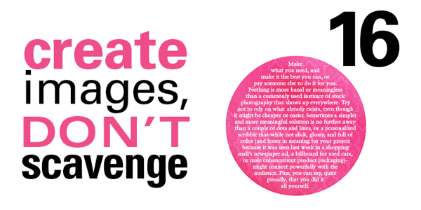
16 – CREATE YOUR OWN IMAGES.

Itʼs so much easier to find a stock photo and drop some type on top of it. But anyone can do that, and they do. At the very least, alter found images to transform them into the right images: customise for your client, customize for your audience.

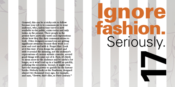
17 – TRY TO IGNORE FASHION. REALLY!

Whatʼs currently fashionable sells but can be forgotten very quickly. You might make some money, but how will you feel in the morning? And how will your contribution be remembered in 100 years? Keep the word timeless in your head, and make decisions based on concept, meaning, and function, not the latest, shallow trend. If you can…

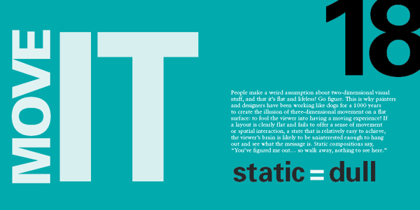
18 – MOVE IT! STATIC EQUALS DULL.

Two-dimensional images that appear kinetic (in motion) attract greater attention and retain interest longer than those that seem tired, stiff, and lifeless. Arranging visual elements asymmetrically, with differing spatial intervals between them contrasting directional emphasis, creates the appearance of spatial depth and movement. Compose wisely.

19 – LOOK TO HISTORY – DON”T REPEAT IT.

Much successful design borrows from past innovators, as does all human endeavors. That said, applying oneʼs understanding of how a famous work achieves its goal and ripping it off are two completely different things. Show some respect… but donʼt cross the line between flattery and forgery.

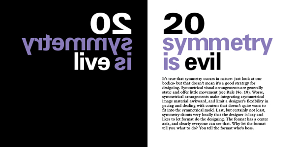
20 – SYMMETRY IS THE ULTIMATE EVIL.

Symmetrically organised material creates repetitive, static spatial intervals, violating rule No.18. Furthermore, symmetry relies on an understood truth about a format – that it has a center – and so it offers nothing new to the viewer


Good Design


If you would like to see the good design award entries check out: https://www.g-mark.org

Check out our designs here: https://a4jp.com/web-design-photography-3d-architectural-models-translating/

Delete all iPhone bookmarks quickly

Delete all iPhone bookmarks quickly

The easiest way is to go to Settings -> then search for iCloud. Disable syncing of Safari. You will be asked what do you want to do with the synced data on your device. Simply select to delete it. Afterwards, there will be no bookmarks via your Safari browser app on the device.

Is Safari opening too slowly because of all your bookmarks?

If it is, change the folder that your iPhone shows first to speed up your phone.

Choose a folder that has a smaller number of bookmarks to show up first by default.

Efficient CSS

Efficient CSS

You need a space after the id

This doesn’t work:

#map.map{blah;}

This works:

#map .map{blah;}


#map .map{blah;}

is more efficient than

#map a{blah;}

<div id=”map”><a class=”map” blah>Text</a></div>


#map .map:hover{color:#000000;}

is more efficient than

#map .map a:hover{color:#000000;}


Writing efficient CSS

IN THIS ARTICLE
How the style system breaks up rules
ID rules
Class rules
Tag rules
Universal rules
How the style system matches rules
Guidelines for efficient CSS
Avoid universal rules
Don’t qualify ID rules with tag names or classes
Don’t qualify class rules with tag names
Use the most specific category possible
Avoid the descendant selector
Tag category rules should never contain a child selector
Question all usages of the child selector
Rely on inheritance
Use -moz-image-region!
Use scoped stylesheets
Original Document Information

This document provides guidelines for optimizing CSS code, and more specifically on how to write efficient selectors.

The CSS specification doesn’t specify how browsers must implement the style system, merely what it must do. Because of this, different style system engines may have completely different performance behaviors, and especially Gecko and WebKit which are open source, implement similar algorithms, with very similar strengths and weaknesses. Therefore the tips presented here should be useful for real-world Web documents.

The first section is a general discussion of how the usual style system categorizes rules. The following sections contain guidelines for writing rules that take advantage of such a style system implementation.

How the style system breaks up rules

The style system breaks rules up into four primary categories:

ID Rules
Class Rules
Tag Rules
Universal Rules

It is critical to understand these categories, as they are the fundamental building blocks of rule matching.

I use the term key selector in the paragraphs that follow. The key selector is the last part of the selector (the part that matches the element being matched, rather than its ancestors).

For example, in the rule…

a img, div > p, h1 + [title] {…}
…the key selectors are img, p, and title.

ID rules

The first category consists of those rules that have an ID selector as their key selector.

Example
button#backButton {…} /* This is an ID-categorized rule */
#urlBar[type=”autocomplete”] {…} /* This is an ID-categorized rule */
treeitem > treerow > treecell#myCell:active {…} /* This is an ID-categorized rule */
Class rules

If a rule has a class specified as its key selector, then it falls into this category.

Example
button.toolbarButton {…} /* A class-based rule */
.fancyText {…} /* A class-based rule */
menuitem > .menu-left[checked=”true”] {…} /* A class-based rule */
Tag rules

If no class or ID is specified as the key selector, the next candidate is the tag category. If a rule has a tag specified as its key selector, then the rule falls into this category.

Example
td {…} /* A tag-based rule */
treeitem > treerow {…} /* A tag-based rule */
input[type=”checkbox”] {…} /* A tag-based rule */

Universal rules

All other rules fall into this category.

Example
[hidden=”true”] {…} /* A universal rule */
* {…} /* A universal rule */
tree > [collapsed=”true”] {…} /* A universal rule */
How the style system matches rules

The style system matches rules by starting with the key selector, then moving to the left (looking for any ancestors in the rule’s selector). As long as the selector’s subtree continues to check out, the style system continues moving to the left until it either matches the rule, or abandons because of a mismatch.

The most fundamental concept to learn is this rule filtering. The categories exist in order to filter out irrelevant rules (so the style system doesn’t waste time trying to match them).

This is the key to dramatically increasing performance. The fewer rules required to check for a given element, the faster style resolution will be.

For example, if an element has an ID, then only ID rules that match the element’s ID will be checked. Only Class Rules for a class found on the element will be checked. Only Tag Rules that match the tag will be checked. Universal Rules will always be checked.

Guidelines for efficient CSS

Avoid universal rules

Make sure a rule doesn’t end up in the universal category!

Don’t qualify ID rules with tag names or classes

If a rule has an ID selector as its key selector, don’t add the tag name to the rule. Since IDs are unique, adding a tag name would slow down the matching process needlessly.

BAD
button#backButton {…}
BAD
.menu-left#newMenuIcon {…}
GOOD
#backButton {…}
GOOD
#newMenuIcon {…}
Exception: When it’s desirable to change the class of an element dynamically in order to apply different styles in different situations, but the same class is going to be shared with other elements.
Don’t qualify class rules with tag names

The previous concept also applies here. Though classes can be used many times on the same page, they are still more unique than a tag.

One convention you can use is to include the tag name in the class name. However, this may cost some flexibility; if design changes are made to the tag, the class names must be changed as well. (It’s best to choose strictly semantic names, as such flexibility is one of the aims of separate stylesheets.)

BAD
treecell.indented {…}
GOOD
.treecell-indented {…}
BEST
.hierarchy-deep {…}
Use the most specific category possible

The single biggest cause of slowdown is too many rules in the tag category. By adding classes to our elements, we can further subdivide these rules into Class Categories, which eliminates time spent trying to match rules for a given tag.

BAD
treeitem[mailfolder=”true”] > treerow > treecell {…}
GOOD
.treecell-mailfolder {…}
Avoid the descendant selector

The descendant selector is the most expensive selector in CSS. It is dreadfully expensive—especially if the selector is in the Tag or Universal Category.

Frequently, what is really desired is the child selector. For instance, the performances are so bad, that descendant selectors are banned in Firefox’ User Interface CSS, without a specific justification. It’s a good idea to do the same on your Web pages

BAD
treehead treerow treecell {…}
BETTER, BUT STILL BAD (see next guideline)
treehead > treerow > treecell {…}
Tag category rules should never contain a child selector

Avoid using the child selector with tag category rules. This will dramatically lengthen the match time (especially if the rule is likely to be matched) for all occurrences of that element.

BAD
treehead > treerow > treecell {…}
GOOD
.treecell-header {…}
Question all usages of the child selector

Exercise caution when using the child selector. Avoid it if you can.

In particular, the child selector is frequently used with RDF trees and menus like so:

BAD
treeitem[IsImapServer=”true”] > treerow > .tree-folderpane-icon {…}
Remember that REF attributes can be duplicated in a template! Take advantage of this. Duplicate RDF properties on child XUL elements in order to change them based on the attribute.

GOOD
.tree-folderpane-icon[IsImapServer=”true”] {…}
Rely on inheritance

Learn which properties inherit, and allow them to do so!

For example, XUL widgets are explicitly set up such that a parent’s list-style-image or font rules will filter down to anonymous content. It’s not necessary to waste time on rules that talk directly to anonymous content.

BAD
#bookmarkMenuItem > .menu-left { list-style-image: url(blah) }
GOOD
#bookmarkMenuItem { list-style-image: url(blah) }
In the above example, the desire to style anonymous content (without leveraging the inheritance of list-style-image) resulted in a rule that was in the Class Category, when the rule should have ended up in the ID Category—the most specific category of all!

Remember: Elements all have the same classes—especially anonymous content!

The above “bad” rule forces every menu’s icons to be tested for containment within the bookmarks menu item. Since there are many menus, this is extraordinarily expensive. Instead, the “good” rule limits the testing to the bookmarks menu.

Use -moz-image-region!

Putting a bunch of images into a single image file and selecting them with -moz-image-region performs significantly better than putting each image into its own file.

Use scoped stylesheets

If you specify a stylesheet as an XBL resource, the styles only apply to the bound elements and their anonymous content. This reduces the inefficiency of universal rules and child selectors because there are fewer elements to consider.

 

Original Document Information

Author: David Hyatt
Original Document Date: 2000-04-21
Original Document URL: www.mozilla.org/xpfe/goodcss.html

Our magic toolbar.

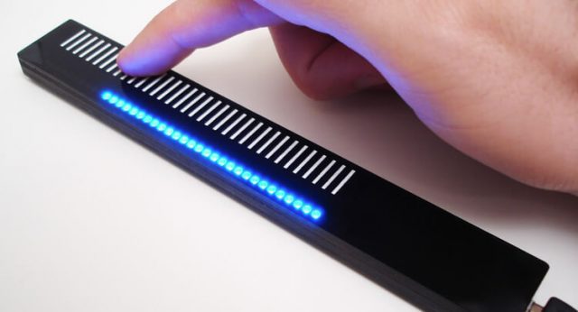
The Magic Toolbar

First of all, this (Magic Toolbar) is not just an extra controller for your PC it’s a shift in the way we can interact with almost any device that has either a USB or Thunderbolt connector.

Not only does this OLED USB magic toolbar allow you to search for pages easily but it can be adjusted for any page or program through settings or individual apps running. Because of this it’s a great addition to any PC or supported system.

Magic Toolbar (the magic toolbar)

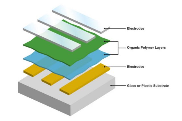
OLED Definition

OLED (Organic Light-Emitting Diode): Much as LEDs produce both light and color, OLEDs are small efficient LEDs made from organic compounds. They are usually used in TVs, computer, and mobile device displays because the black areas don’t need power and as nothing is lit up you can get almost perfect blacks on your screen.

History of OLEDs

André Bernanose and co-workers at the Nancy-Université in France made the first observations of electroluminescence in organic materials in the early 1950s. They applied high alternating voltages in air to materials such as acridine orange, either deposited on or dissolved in cellulose or cellophane thin films. The proposed mechanism was either direct excitation of the dye molecules or excitation of electrons. As a result of this, the OLED was born.

Martin Pope

In 1960, Martin Pope and some of his co-workers at New York University connected ohmic dark-injecting electrode contacts to organic crystals. They further described the necessary energetic requirements (work functions) for the hole and electron injecting electrode contacts. These contacts were the basis of charge injection used in all modern OLED devices. Martin Pope’s group first observed direct current (DC) electroluminescence under a vacuum on a single pure anthracene crystal and on anthracene crystals doped with tetracene in 1963. They used a small silver electrode and 400 volts of power to do this field-accelerated electron excitation of molecular fluorescence.

W. Helfrich and W. G. Schneider

In 1965, W. Helfrich and W. G. Schneider of the National Research Council in Canada produced double injection recombination electroluminescence for the first time in a single anthracene crystal using the hole and electron injecting electrodes, the forerunner of modern double-injection devices. In the same year, Dow Chemical researchers patented a method of preparing electroluminescent cells using high-voltage (500–1500 V) AC-driven (100–3000 Hz) electrically insulated one millimetre thin layers of melted phosphor made of ground anthracene, tetracene, and graphite powder. Their proposed mechanism involved electronic excitation at the contacts between the graphite particles and the anthracene molecules.

Roger Partridge

Roger Partridge made the first observation of electroluminescence from polymer films at the National Physical Laboratory in the United Kingdom. The device consisted of a film of poly (N-vinylcarbazole) up to 2.2 micrometers thick located between two charge injecting electrodes. Roger Partridge patented the project in 1975 and published the findings in 1983.

Due to all of these scientific discoveries we now have OLED screens. The next challenge is to either reduce the burn-in associated with OLEDs or reduce power consumption rates though.

Although this device (Magic Toolbar) has the same function as an LCD touch screen it can do so much more… Contact us for more details.

Image updated: 2016-10-25th

エゾプロダクト Ezoproduct Inc.

エゾプロダクト – Ezoproduct Inc.

エゾプロダクト

http://ezopro.com/


A4JP.COM DESIGN
Copyright & NPO Study © 2025