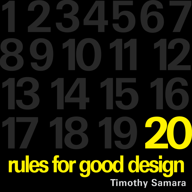
20 Rules for Good Design – Part 1 to 10
20 Rules for Good Design from Timothy Samara’s Book, “Graphic Design Elements.”
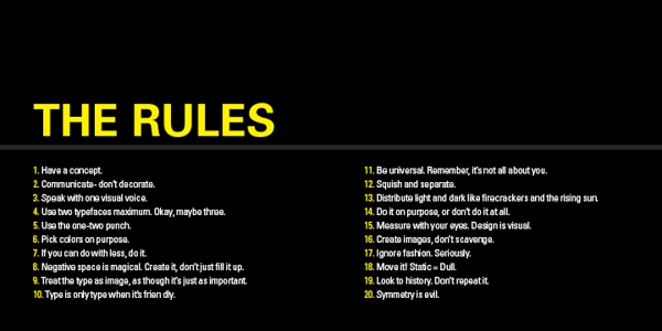
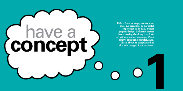
1 – HAVE A CONCEPT.
You need to begin with an idea. It may be very simple or neutral – “Itʼs important to organise this information to be easily navigable” – or it may be creatively contrived – “These biscuits will seem more delicious if they appear to be made by elves.” No idea = No design.
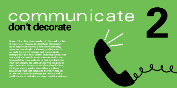
2 – COMMUNICATE – DON’T DECORATE.
Form. it is often said (not often enough, lately) follows function. This means two things. First – every dot, line, texture, shape, colour, and image should be related to the concept that must be conveyed (rule No. 1). Second, each of these forms should add to the concept. If the form is there solely because you think itʼs cool, you should probably get rid of it.
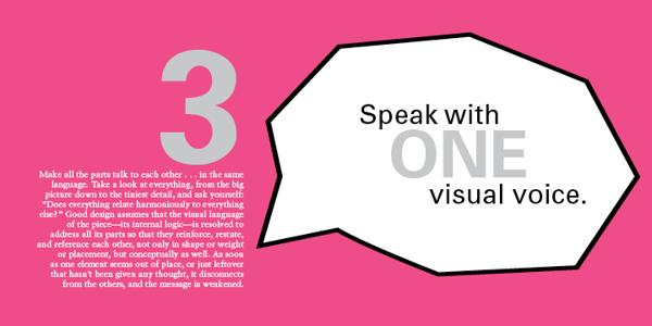
3 – SPEAK WITH ONE VISUAL VOICE.
All the parts of a project really should be recognisably related to each other on a visual level. That is, they must share some similar qualities in order to appear part of the same unified message.
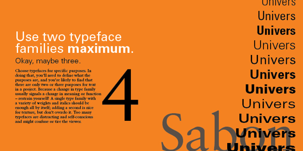
4 – USE TWO TYPEFACES – MAX.
Ok – maybe three…. no just two, typefaces only get you so far, even stylistically. Itʼs what you DO with the type that really says something. For hardcore, hierarchical concerns, one type family with a range of weights and widths should be enough.
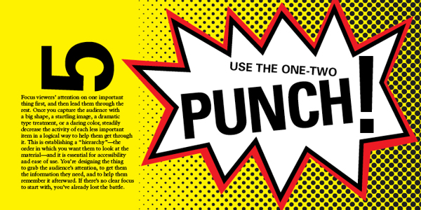
5 – SHOW ONE THING FIRST.
Hierarchy again…. Give visual emphasis to one item to grab the viewer’s attention. Then direct them – through a progression of size, weight, and colour changes, and so on – down the line of importance items or instructions. If they have to figure out what to look at first, they’ll get confused and leave or just throw what ever the item of communication is in the bin.
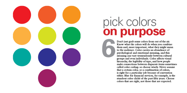
6 – PICK COLOURS FOR A PURPOSE.
As subjective as colour perception is, it’s shouldn’t be all guesswork. Colours mean things culturally, and colours have optical relationships to each other. Use these “factual” aspects to choose and combine colours in a meaningful way – and in an optically dynamic way.
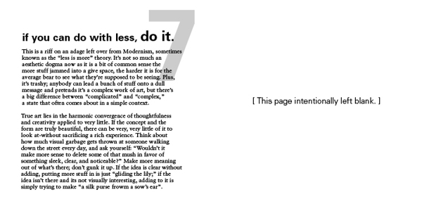
7 – IF YOU CAN DO WITH LESS, DO SO.
This is another way of saying “Less is more.” It’s about being economical: Try to show only what is necessary. If “necessary” can be pared down a bit, too, that’s a good thing. Think about how many messages, how many resources, how many annoying blobs of information the average viewer has to deal with on a regular basis (never mind the landfill). Now, design accordingly.
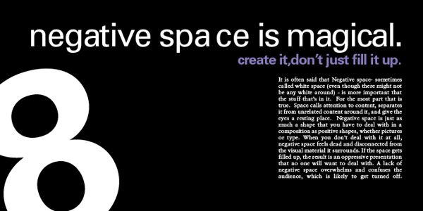
8 – NEGATIVE SPACE IS IMPORTANT: CREATE IT, DON’T FILL IT UP!
Despite the fact that the space in a format around the shapes and pictures and text is apparently empty, it’s really a shape unto itself. Consider it as carefully as you would anything that you plop into it. The better integrated the negative space and the more interesting it is, the stronger the composition.
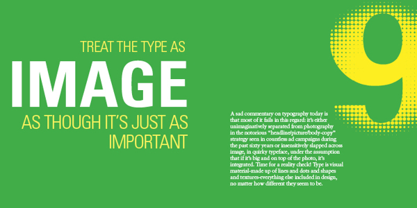
9 – TREAT TYPE LIKE IMAGE.
This is one of the most difficult rules to master. Type actually is an image, even though it looks like something else. It must be considered for its visual qualities, relative to other image material, to integrate it into compositions – even more so when there’s a lot of it.
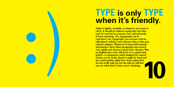
10 – KEEP TYPE FRIENDLY.
If it’s illegible, it’s not type. If it’s illegible it’s not type. And if itʼs illegible, itʼs not type. Consider the audience – their assumed level of education, their schedule, and especially their age – when choosing styles and sizes. Written language exists to transmit information, and your client is paying you to transmit such information on their behalf. If the information canʼt be read – for any reason – itʼs no longer useful, and youʼre potentially out of a job.
20 Rules for Good Design – Part 11 to 20
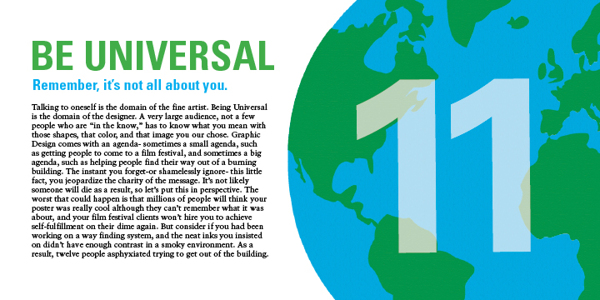
11 – BE UNIVERSAL, IT’S NOT ABOUT YOU.
If youʼre interested in expressing your fetishes or psychoses, become a painter (fine art not wall) and work the gallery scene (seriously – it can pay alot better). The purpose of design is populist in nature: you re creating clear messages for other people. The more understandable the images you make, the better.
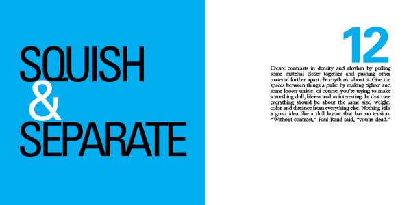
12 – CREATE RHYTHMS.
The antidote to visual boredom is tension, and there are two easy ways to achieve this antidote: The first is by constantly varying the sizes, weights, and spaces among visual elements so that they appear to be constantly shifting and moving. And….
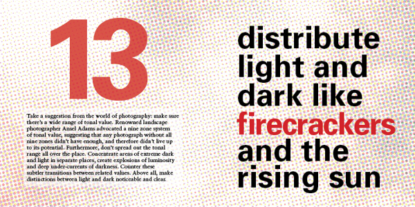
13- USE CONTRAST: DARK & LIGHT.
Radically vary the lightness and darkness in different areas of a composition, as well as the quality of dark and light values: Sharp and aggressive, fluid and murky, bold and clean…
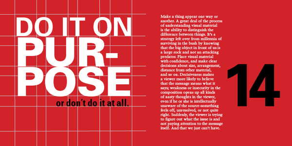
14 – BE DECISIVE: DO OR DON’T.
Avoid being wishy-washy in arranging things. Visual elements should be clearly one thing or another, one way or another. Ambiguity can be useful, but even this should be on purpose, not a sloppy by-product of indecision.
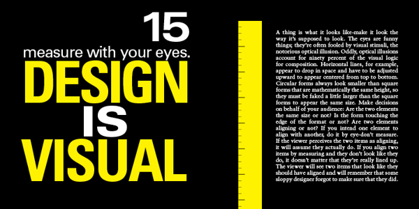
15 – MEASURE WITH YOUR EYES.
A majority of formal relationships play havoc with your eyes – for example, a solid dot and a square can appear to be different sizes if they are mathematically the same measure in height: circles appear to contract in a space because of their ill defined, endless contour.
All visual forms play off each other, so make them behave the way you want them to look like theyʼre behaving. Use your eyes: it usually will look better that way – and the more you do it the better you will get at it – like everything in life.
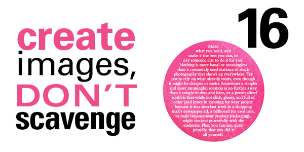
16 – CREATE YOUR OWN IMAGES.
Itʼs so much easier to find a stock photo and drop some type on top of it. But anyone can do that, and they do. At the very least, alter found images to transform them into the right images: customise for your client, customize for your audience.
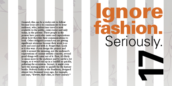
17 – TRY TO IGNORE FASHION. REALLY!
Whatʼs currently fashionable sells but can be forgotten very quickly. You might make some money, but how will you feel in the morning? And how will your contribution be remembered in 100 years? Keep the word timeless in your head, and make decisions based on concept, meaning, and function, not the latest, shallow trend. If you can…
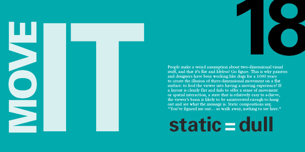
18 – MOVE IT! STATIC EQUALS DULL.
Two-dimensional images that appear kinetic (in motion) attract greater attention and retain interest longer than those that seem tired, stiff, and lifeless. Arranging visual elements asymmetrically, with differing spatial intervals between them contrasting directional emphasis, creates the appearance of spatial depth and movement. Compose wisely.
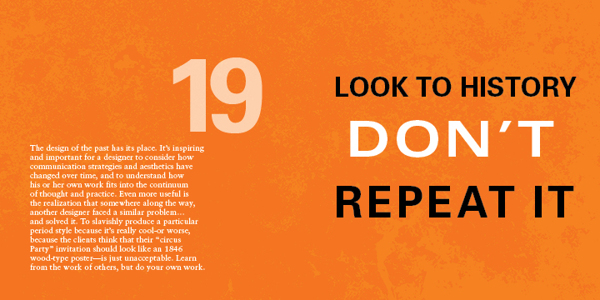
19 – LOOK TO HISTORY – DON”T REPEAT IT.
Much successful design borrows from past innovators, as does all human endeavors. That said, applying oneʼs understanding of how a famous work achieves its goal and ripping it off are two completely different things. Show some respect… but donʼt cross the line between flattery and forgery.
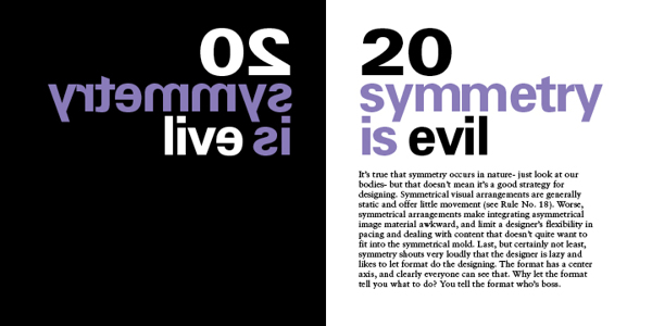
20 – SYMMETRY IS THE ULTIMATE EVIL.
Symmetrically organised material creates repetitive, static spatial intervals, violating rule No.18. Furthermore, symmetry relies on an understood truth about a format – that it has a center – and so it offers nothing new to the viewer