ホームページ制作|札幌
ホームページ制作|札幌
北海道札幌市北区北6条西6丁目2-1朝日プラザ偕楽園506号室
営業時間 7:00-24:00 TEL/FAX 011-768-8116
代表:グレン チャールズ ロウ
27 Online (オンライン中(4ゲスト Guests 23検索ボート Bots, )

Category Archives: design

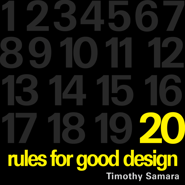
20 Rules for Good Design

20 Rules for Good Design


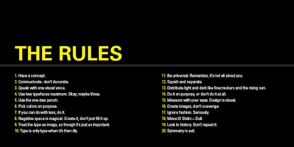
20 Rules for Good Design – Part 1 to 10


20 Rules for Good Design from Timothy Samara’s Book, “Graphic Design Elements.”

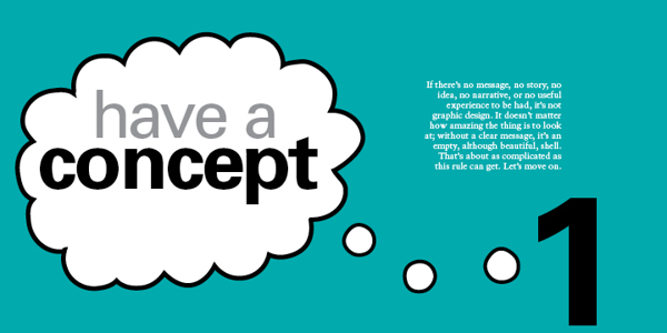
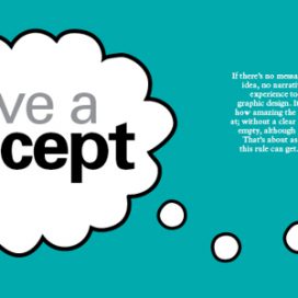
1 – HAVE A CONCEPT.

For good design, you need to begin with an idea. It may be very simple or neutral – “Itʼs important to organise this information to be easily navigable” – or it may be creatively contrived – “These biscuits will seem more delicious if they appear to be made by elves.” No idea = No design.

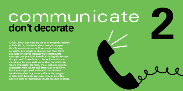
2 – COMMUNICATE  – DON’T DECORATE.

Form. it is often said (not often enough, lately) follows function. This means two things. First – every dot, line, texture, shape, colour, and image should be related to the concept that must be conveyed (rule No. 1). Second, each of these forms should add to the concept. If the form is there solely because you think itʼs cool, you should probably get rid of it.

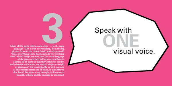
3 – SPEAK WITH ONE VISUAL VOICE.

All the parts of a project really should be recognisably related to each other on a visual level. That is, they must share some similar qualities in order to appear part of the same unified message.

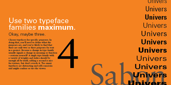
4 – USE TWO TYPEFACES – MAX.

Ok – maybe three…. no just two, typefaces only get you so far, even stylistically. Itʼs what you DO with the type that really says something. For hardcore, hierarchical concerns, one type family with a range of weights and widths should be enough.

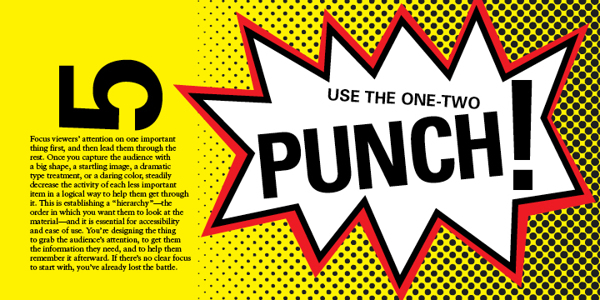
5 – SHOW ONE THING FIRST.

Hierarchy again…. Give visual emphasis to one item to grab the viewer’s attention. Then direct them – through a progression of size, weight, and colour changes, and so on – down the line of importance items or instructions. If they have to figure out what to look at first, they’ll get confused and leave or just throw what ever the item of communication is in the bin.

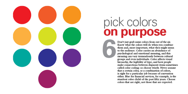
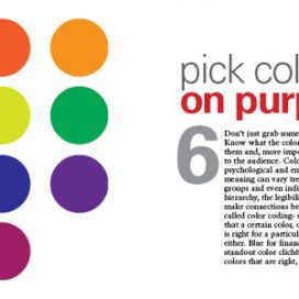
6 – PICK COLOURS FOR A PURPOSE.

As subjective as colour perception is, it’s shouldn’t be all guesswork. Colours mean things culturally, and colours have optical relationships to each other. Use these “factual” aspects to choose and combine colours in a meaningful way – and in an optically dynamic way.

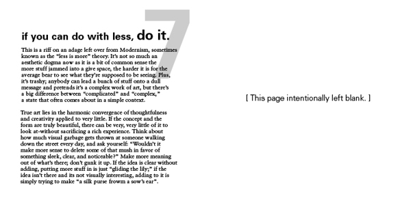
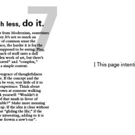
7 – IF YOU CAN DO WITH LESS, DO SO.

This is another way of saying “Less is more.” It’s about being economical: Try to show only what is necessary. If “necessary” can be pared down a bit, too, that’s a good thing. Think about how many messages, how many resources, how many annoying blobs of information the average viewer has to deal with on a regular basis (never mind the landfill). Now, design accordingly.

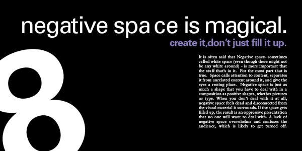
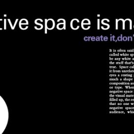
8 – NEGATIVE SPACE IS IMPORTANT: CREATE IT, DON’T FILL IT UP!

Despite the fact that the space in a format around the shapes and pictures and text is apparently empty, it’s really a shape unto itself. Consider it as carefully as you would anything that you plop into it. The better integrated the negative space and the more interesting it is, the stronger the composition.

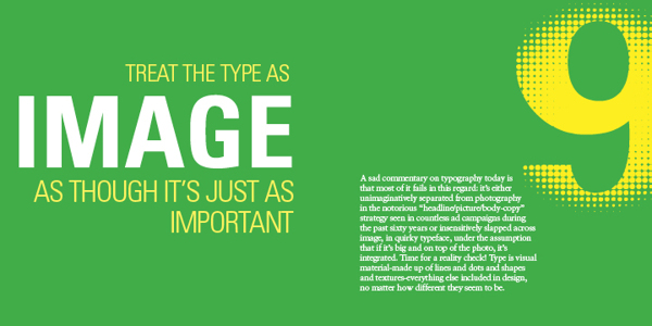
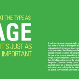
9 – TREAT TYPE LIKE IMAGE.

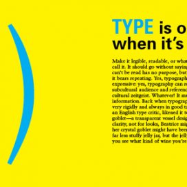
This is one of the most difficult rules to master. Type actually is an image, even though it looks like something else. It must be considered for its visual qualities, relative to other image material, to integrate it into compositions – even more so when there’s a lot of it.

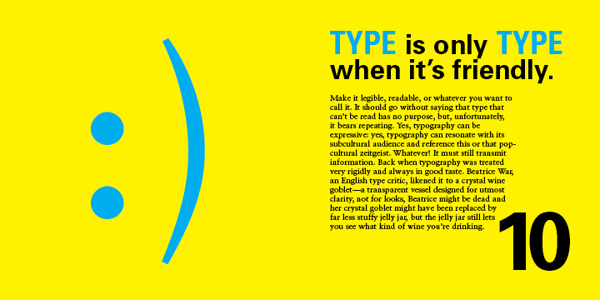
10 – KEEP TYPE FRIENDLY.

If it’s illegible, it’s not type. If it’s illegible it’s not type. And if itʼs illegible, itʼs not type. Consider the audience – their assumed level of education, their schedule, and especially their age – when choosing styles and sizes. Written language exists to transmit information, and your client is paying you to transmit such information on their behalf. If the information canʼt be read – for any reason – itʼs no longer useful, and youʼre potentially out of a job.


20 Rules for Good Design – Part 11 to 20


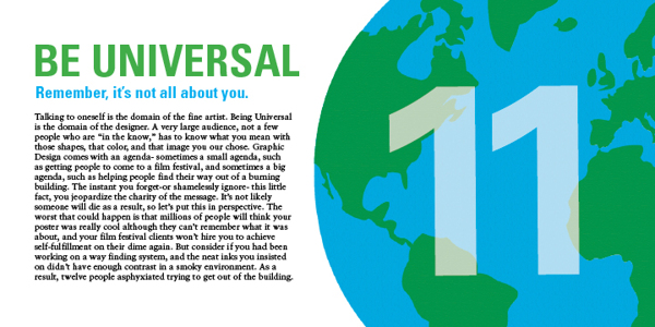
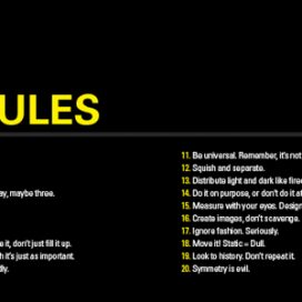
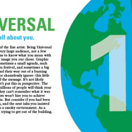
11 – BE UNIVERSAL, IT’S NOT ABOUT YOU.

If youʼre interested in expressing your fetishes or psychoses, become a painter (fine art not wall) and work the gallery scene (seriously – it can pay alot better). The purpose of design is populist in nature: you re creating clear messages for other people. The more understandable the images you make, the better.

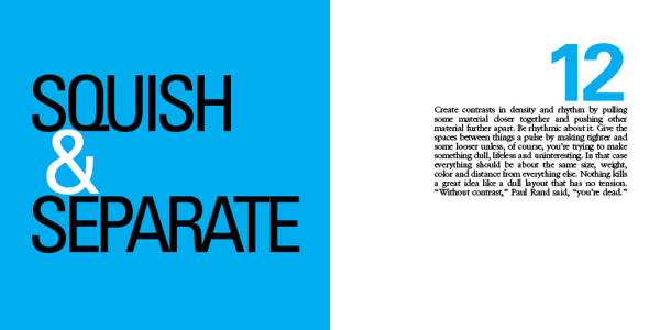
12 – CREATE RHYTHMS.

The antidote to visual boredom is tension, and there are two easy ways to achieve this antidote: The first is by constantly varying the sizes, weights, and spaces among visual elements so that they appear to be constantly shifting and moving. And….

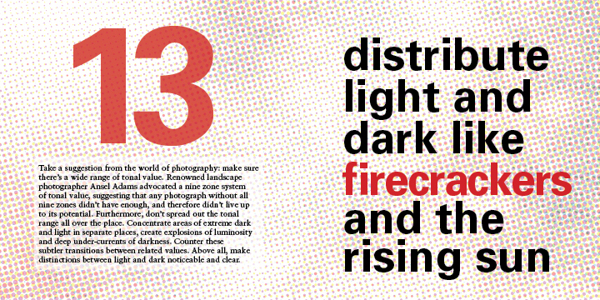
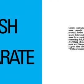
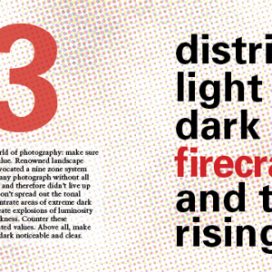
13- USE CONTRAST: DARK & LIGHT.

Radically vary the lightness and darkness in different areas of a composition, as well as the quality of dark and light values: Sharp and aggressive, fluid and murky, bold and clean…

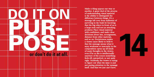
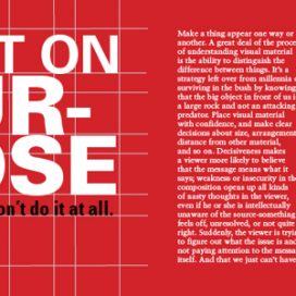
14 – BE DECISIVE: DO OR DON’T.

Avoid being wishy-washy in arranging things. Visual elements should be clearly one thing or another, one way or another. Ambiguity can be useful, but even this should be on purpose, not a sloppy by-product of indecision.

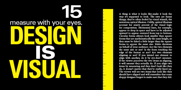
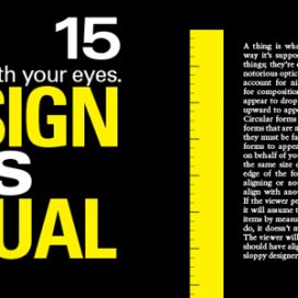
15 – MEASURE WITH YOUR EYES.

A majority of formal relationships play havoc with your eyes – for example, a solid dot and a square can appear to be different sizes if they are mathematically the same measure in height: circles appear to contract in a space because of their ill defined, endless contour.

All visual forms play off each other, so make them behave the way you want them to look like theyʼre behaving. Use your eyes: it usually will look better that way – and the more you do it the better you will get at it – like everything in life.

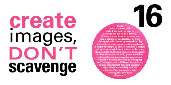
16 – CREATE YOUR OWN IMAGES.

Itʼs so much easier to find a stock photo and drop some type on top of it. But anyone can do that, and they do. At the very least, alter found images to transform them into the right images: customise for your client, customize for your audience.

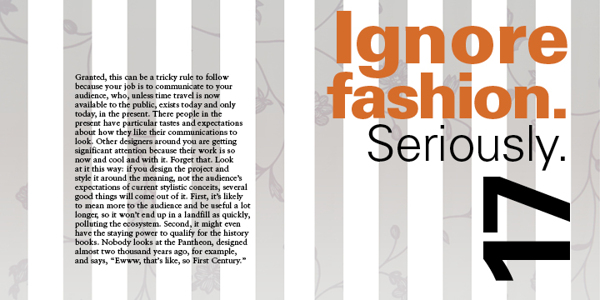
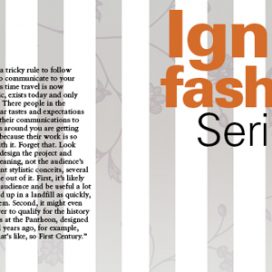
17 – TRY TO IGNORE FASHION. REALLY!

Whatʼs currently fashionable sells but can be forgotten very quickly. You might make some money, but how will you feel in the morning? And how will your contribution be remembered in 100 years? Keep the word timeless in your head, and make decisions based on concept, meaning, and function, not the latest, shallow trend. If you can…

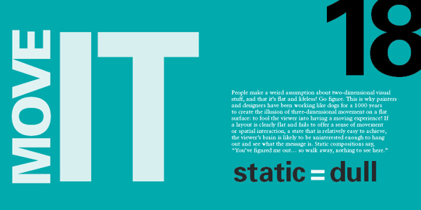
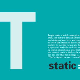
18 – MOVE IT! STATIC EQUALS DULL.

Two-dimensional images that appear kinetic (in motion) attract greater attention and retain interest longer than those that seem tired, stiff, and lifeless. Arranging visual elements asymmetrically, with differing spatial intervals between them contrasting directional emphasis, creates the appearance of spatial depth and movement. Compose wisely.

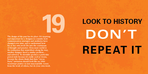
19 – LOOK TO HISTORY – DON”T REPEAT IT.

Much successful design borrows from past innovators, as does all human endeavors. That said, applying oneʼs understanding of how a famous work achieves its goal and ripping it off are two completely different things. Show some respect… but donʼt cross the line between flattery and forgery.

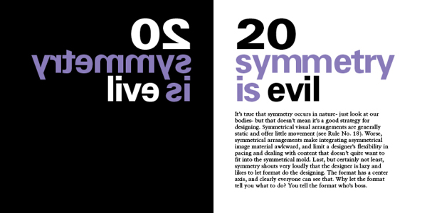
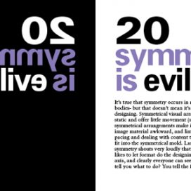
20 – SYMMETRY IS THE ULTIMATE EVIL.

Symmetrically organised material creates repetitive, static spatial intervals, violating rule No.18. Furthermore, symmetry relies on an understood truth about a format – that it has a center – and so it offers nothing new to the viewer


Good Design

If you would like to see the good design award entries check out: https://www.g-mark.org

Check out our designs here: https://a4jp.com/web-design-photography-3d-architectural-models-translating/

20 Rules for Good Design

20 Rules for Good Design


20 Rules for Good Design – Part 1 to 10


20 Rules for Good Design from Timothy Samara’s Book, “Graphic Design Elements.”

1 – HAVE A CONCEPT.

You need to begin with an idea. It may be very simple or neutral – “Itʼs important to organise this information to be easily navigable” – or it may be creatively contrived – “These biscuits will seem more delicious if they appear to be made by elves.” No idea = No design.

2 – COMMUNICATE  – DON’T DECORATE.

Form. it is often said (not often enough, lately) follows function. This means two things. First – every dot, line, texture, shape, colour, and image should be related to the concept that must be conveyed (rule No. 1). Second, each of these forms should add to the concept. If the form is there solely because you think itʼs cool, you should probably get rid of it.

3 – SPEAK WITH ONE VISUAL VOICE.

All the parts of a project really should be recognisably related to each other on a visual level. That is, they must share some similar qualities in order to appear part of the same unified message.

4 – USE TWO TYPEFACES – MAX.

Ok – maybe three…. no just two, typefaces only get you so far, even stylistically. Itʼs what you DO with the type that really says something. For hardcore, hierarchical concerns, one type family with a range of weights and widths should be enough.

5 – SHOW ONE THING FIRST.

Hierarchy again…. Give visual emphasis to one item to grab the viewer’s attention. Then direct them – through a progression of size, weight, and colour changes, and so on – down the line of importance items or instructions. If they have to figure out what to look at first, they’ll get confused and leave or just throw what ever the item of communication is in the bin.

6 – PICK COLOURS FOR A PURPOSE.

As subjective as colour perception is, it’s shouldn’t be all guesswork. Colours mean things culturally, and colours have optical relationships to each other. Use these “factual” aspects to choose and combine colours in a meaningful way – and in an optically dynamic way.

7 – IF YOU CAN DO WITH LESS, DO SO.

This is another way of saying “Less is more.” It’s about being economical: Try to show only what is necessary. If “necessary” can be pared down a bit, too, that’s a good thing. Think about how many messages, how many resources, how many annoying blobs of information the average viewer has to deal with on a regular basis (never mind the landfill). Now, design accordingly.

8 – NEGATIVE SPACE IS IMPORTANT: CREATE IT, DON’T FILL IT UP!

Despite the fact that the space in a format around the shapes and pictures and text is apparently empty, it’s really a shape unto itself. Consider it as carefully as you would anything that you plop into it. The better integrated the negative space and the more interesting it is, the stronger the composition.

9 – TREAT TYPE LIKE IMAGE.

This is one of the most difficult rules to master. Type actually is an image, even though it looks like something else. It must be considered for its visual qualities, relative to other image material, to integrate it into compositions – even more so when there’s a lot of it.

10 – KEEP TYPE FRIENDLY.

If it’s illegible, it’s not type. If it’s illegible it’s not type. And if itʼs illegible, itʼs not type. Consider the audience – their assumed level of education, their schedule, and especially their age – when choosing styles and sizes. Written language exists to transmit information, and your client is paying you to transmit such information on their behalf. If the information canʼt be read – for any reason – itʼs no longer useful, and youʼre potentially out of a job.


20 Rules for Good Design – Part 11 to 20


11 – BE UNIVERSAL, IT’S NOT ABOUT YOU.

If youʼre interested in expressing your fetishes or psychoses, become a painter (fine art not wall) and work the gallery scene (seriously – it can pay alot better). The purpose of design is populist in nature: you re creating clear messages for other people. The more understandable the images you make, the better.

12 – CREATE RHYTHMS.

The antidote to visual boredom is tension, and there are two easy ways to achieve this antidote: The first is by constantly varying the sizes, weights, and spaces among visual elements so that they appear to be constantly shifting and moving. And….

13- USE CONTRAST: DARK & LIGHT.

Radically vary the lightness and darkness in different areas of a composition, as well as the quality of dark and light values: Sharp and aggressive, fluid and murky, bold and clean…

14 – BE DECISIVE: DO OR DON’T.

Avoid being wishy-washy in arranging things. Visual elements should be clearly one thing or another, one way or another. Ambiguity can be useful, but even this should be on purpose, not a sloppy by-product of indecision.

15 – MEASURE WITH YOUR EYES.

A majority of formal relationships play havoc with your eyes – for example, a solid dot and a square can appear to be different sizes if they are mathematically the same measure in height: circles appear to contract in a space because of their ill defined, endless contour.

All visual forms play off each other, so make them behave the way you want them to look like theyʼre behaving. Use your eyes: it usually will look better that way – and the more you do it the better you will get at it – like everything in life.

16 – CREATE YOUR OWN IMAGES.

Itʼs so much easier to find a stock photo and drop some type on top of it. But anyone can do that, and they do. At the very least, alter found images to transform them into the right images: customise for your client, customize for your audience.

17 – TRY TO IGNORE FASHION. REALLY!

Whatʼs currently fashionable sells but can be forgotten very quickly. You might make some money, but how will you feel in the morning? And how will your contribution be remembered in 100 years? Keep the word timeless in your head, and make decisions based on concept, meaning, and function, not the latest, shallow trend. If you can…

18 – MOVE IT! STATIC EQUALS DULL.

Two-dimensional images that appear kinetic (in motion) attract greater attention and retain interest longer than those that seem tired, stiff, and lifeless. Arranging visual elements asymmetrically, with differing spatial intervals between them contrasting directional emphasis, creates the appearance of spatial depth and movement. Compose wisely.

19 – LOOK TO HISTORY – DON”T REPEAT IT.

Much successful design borrows from past innovators, as does all human endeavors. That said, applying oneʼs understanding of how a famous work achieves its goal and ripping it off are two completely different things. Show some respect… but donʼt cross the line between flattery and forgery.

20 – SYMMETRY IS THE ULTIMATE EVIL.

Symmetrically organised material creates repetitive, static spatial intervals, violating rule No.18. Furthermore, symmetry relies on an understood truth about a format – that it has a center – and so it offers nothing new to the viewer

オーストラリアキャンベラ

オーストラリアキャンベラ

面白い:)紐みたいデザイン

Autodesk Avoids Bug Reports

You would think an award winning company like Autodesk would love to hear about bugs in it’s software to fix it and make it even better… But just try and send them a message…

I got a message saying I have to pay for a product to tell Autodesk they have a bug! And my user id can’t be used in the forums they have anymore. Only the free area, which is okay but they send you a message saying they don’t offer support to people that don’t use their programs instead of actually saying they will try and fix the problem.

Autodesk Autocad Architecture 2013 64-bit Bug: The shift button doesn’t work when placing stairs. The shift key should flip the justification but nothing happens. It says you can do that in the help files and the little balloons that pop-up with advice though…

The Free Adobe CS6 Master Collection Demo Download Has Bugs. Take Care! (Illustrator CS6)

Unfortunately, it looks like the original free Adobe CS6 trial/demo software has been let loose on the internet and it has bugs. So keep your money in your pockets until it gets fixed!

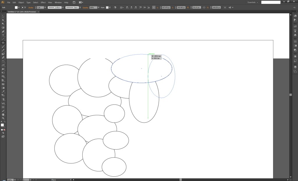
My trusty old CS2 works fine but from version CS3 of Illustrator it has had a refresh bug which kind of got hidden from everyone. Lucky I tried the demo in the shop before I wasted money upgrading. And in CS4, CS5 and CS6 all version of Illustrator still have the same problem. Just there is a white box hiding everything when you draw something and scroll the screen (try the line tool or shapes). The screen refreshes after you stop holding down the mouse button. The pen tool doesn’t have this problem in CS6 but the line and shape tools do. This make tracing maps a nightmare or anything else bigger than the art board.

Illustrator CS6 not showing lines

When you pay $2600 for software you expect bug free programs that are easy to use but for some reason Adobe doesn’t wanna fix this problem and many others.

I just can’t figure out why they don’t wanna fix it. Maybe if enough people complain they will do something or we can all just use the free software out there until they get their butts into gear.

Oh yeah and in CS6 if you do some line art on a Wacom Intuos 5 tablet and try to nudge it in CS6 the image moves a bit then tries to update itself every time between then nudge increments rendering the nudge tool useless.

Let’s see if the programmers surprise us this time with a fully functioning program.

Illustrator CS6 rating: 3/10

CS6 Master Collection: 7/10

Pros: Nice interface

Cons: Unfixed bugs

Release Date: Today (May 1st) Official Release Date: May 11th

Second Life

Second Life

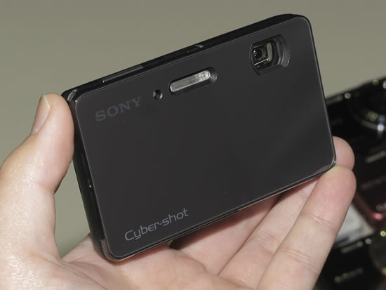
Sony Cyber-shot DSC-TX300V / DSC-TX200V 18.2 MP Compact Digital Camera – Release Date: March 9th

Sony Cyber-shot DSC-TX300V / DSC-TX200V 18.2 MP compact digital camera is being released on March 9th

DSC-TX300V on a4jp.comThe DSC-TX300V is the wireless version.

Pity they didn’t make the battery life any longer. This could have been an amazing camera if they could have got the battery life back up around the 200 minute mark. You will probably need one or two spare batteries which cost 3,980 yen each.

Sony is finally bringing out 2 new TX series camera as far as I can see. One will be called the DSC-TX300V and the other the is the DSC-TX200V. Both have 18.2 megapixels sensors, and they sound pretty good if they have clear pixels. The Sony DSC-WX30 I have produces pixels that looked like someone has just used finger paint to make them so I’m hoping they’re nothing like that. And I’m also wondering if the new front glass panels are going to shatter if we drop the cameras… Kind of like on the disastrous Apple iPhone 4 and 4s phones.

At this point of time, it is unfortunately unknown if the DSC-TX300V or DSC-TX200V will include a white-balance color shift setting but it looks like we can adjust the warmth and coolness of shots.

None of the Sony cameras I have owned so far have been able to reproduce purple colors accurately. They always end up as some weird shade of blue and that’s why they definitely need the color shift settings. The NEX-7 has them along with the Pentax cameras and a lot of other companies.

The Japanese NEX-7 looked good but it was lacking English / any language settings… I thought Japan was trying to help everyone speak English here.

The size of the DSC-TX300V and DSC-TX200V is great for people that like hiking and the outdoors. Most of us don’t want to lug around a huge SLR any more and these cameras are just getting better and better all the time. It easily fits in your pocket with out any troubles. *The battery life is only 110 minutes and it will will run out before you know it… That’s one of this camera’s biggest flaws. You can only also record 29 minutes of video as well. They say because of the European tax system, but Japanese cameras have only got the Japanese menu so that can’t be true. Sony customizes each camera for the country it will be sold in.

The rich black and white filter on the DSC-WX30 can take up to 5 seconds to process one image and the processed image looked quite ugly compared to the beautiful B&W images I can see on the back LCD screen when framing a shot. They must have just wanted to make everyone buy the most expensive camera to get back something like a standard B&W filter and they have done it again with these cameras unless we can turn down the level of the filter somehow… I hope they thought of that.

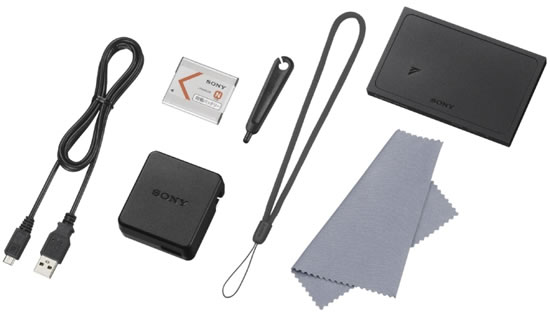
The DSC-TX300V kit on a4jp.com


Pretty Dog Pet Salon – Wallpaper & Screen Saver

Pretty Dog Pet Salon’s computer was broken so we fixed it and replaced the broken hard drive. As a surprise we though we would make a wallpaper image and screen saver for them from their website as well :)

1400px x 900px Wallpaper Image (JPG)

★★札幌市のペットショップ・ペットホテル・ペット美容室★★

Prettyなわんちゃんに遊びに来てもらえる様な、お店を作って行きたいと思います。初めての方でもお気軽にご来店下さい。
店内はいつも清潔を保ち、わんちゃん達に住みよい環境を整えております。JKC公認トリマーA級愛玩動物飼養一級管理士のいるお店です。経験と実績でお客様にご満足頂けるよう勤めております。

掲載名 プリティドッグ
業種 ドッグ美容室、ペットショップ、ペットショップ(犬)、ペット美容室、ペットホテル、ペット用品販売
住所 〒003-0003 北海道札幌市白石区東札幌3条4丁目5-34
電話番号 011-841-3511
FAX番号 011-841-3512

プリティドッグ PNG(透過画像)

iPad Facts and Figures – The iPad 3 will be out soon

The iPad 3 with it’s new amazing screen will be here soon. I just hope they make it view-able in direct sunlight. My mobile phone uses chunks of metal between each view-able pixel to get around this problem.

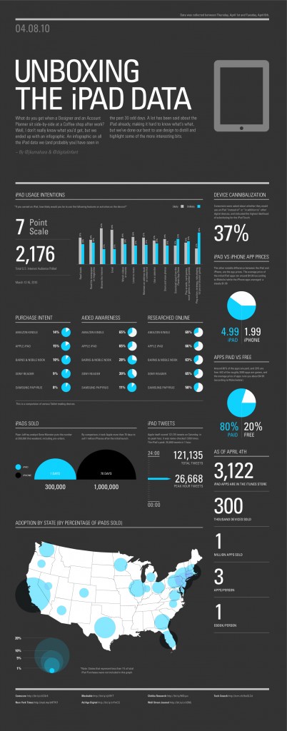
The info graphic below was made by John Kumahara and Johnathan Bonnell. The info graphic contains interesting facts such as usage intention and amount iPad sold compared to the first iPhone.

The majority of users use the iPad to browse the internet, email and read books. Surprisingly only 26% will download (purchase) an app. Although maybe it is not that surprisingly considering an iPad app is an average of three dollars more expensive then an iPhone app. It will be interesting to see Apple’s report later on on how much iPad apps were sold over three months.

I’m starting to really like infographics like these with clear interesting data displayed in a beautiful design. Four weeks ago I also posted an infographic with the facts and figures about Google, which was really clear and informative.

Imagine how great it would be if people made infographics about Macbooks, laptops, blackberry, iPhone, etc. It would be a great aide when researching which product to buy. You will get a clear statistics and spend less hours reading all available reviews and users comment. I hope Jonathan and John will enlighten us with more infographics as nice and informative as this one.

Unboxing the iPad by Jonathan Kumahara and Jonathan Bonnell.


The iPad 2 was released and put in stores ages ago but next the iPad 3 will be out. It is said to have a retina screen and possibly be 3D. I wonder if it will have 2 cameras at the back and on the front.

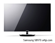
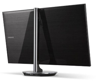
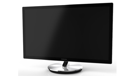
Samsung’s 27 inch SB970, 2560px x 1440px, PLS, FPR, 3D computer monitor S27B970

Samsung’s 27 inch SB970 3D Computer Monitor, 2560px x 1440px, FPR, PLS, Over 1 Billion Colors

Samsung's 27 inch SB970

This is Samsung’s second PLS (Plane Line Switching) monitor.

Samsung’s PLS panel technology debuted on the SA850 last year to impressive results except for the back-lighting.

The S27B970 series monitor is the first monitor since the SA850 to utilize this panel technology and also makes use of Samsung’s exclusive Natural Color Expert technology. Samsung states that this includes “hardware color calibrations within the monitor to ensure there is no displayable loss of tonalities on screen”.

Like the SA850, the 27-inch monitor has a high resolution of 2,560×1,440 pixels (WQHD). The monitor allows for a 4-inch height adjustment and tilt, but it’s unclear whether swivel or pivot are provided.

The circular aluminum base has a USB hub, and video connections including DisplayPort, DVI, and HDMI.  A Mobile High Definition Link (MHL) for MHL-enabled smartphones and tablets available to connect your compatible tablets and smart-phones on this huge screen.

The SB970 arrives in March, with prices starting at $1199.99.

  • Screen size: 27-inch
  • Resolution: 2,560px x 1,440px WQHD (Wide Quad-HD)
  • Aspect ratio: 16:9
  • Brightness: 300 cd/m2
  • Static contrast ratio: 1,000:1;
    Mega 8 DCR on High Bright / Cinema Mode
  • VESA mount: N.A.
  • Viewing angle: 178/178 degrees
  • Vertical lift: 100 mm
  • Built-in 7W stereo speakers
  • HDMI, DVI and DisplayPort inputs
  • Wireless LAN
  • 3 USB ports (2 USB 3.0 & 1 USB 2.0)
  • Over one billion colors
  • On-board color calibration system
  • 65W AC/DC Adapter
Samsung's 27 inch SB970

PLS (Plane Line Switching) monitor with a brushed aluminum finish

Samsung's 27 inch SB970

Samsung’s 27 inch SB970

Anti-glare edge-to-edge tempered glass display and a super slim profile built on an ergonomic height-adjustable aluminum stand that allows users to fluidly adjust the ergonomics including height and angle to their desired viewing position.

The Samsung Series 9 S27B970 Monitor: Looks like it will be a brilliant display.

A4JP.COM DESIGN
Copyright & NPO Study © 2024