

エゾプロダクト – Ezoproduct Inc.
エゾプロダクト
Yeah! We know you are a computer geek and you would know most of the computer shortcuts but hold on. You might want to check these too! 10 computer tricks that you definitely are going to share!
Use control + shift + escape instead! It goes directly to the task manager!
Launch the Task Manager: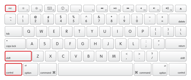
Are you feeling really sick of watching that boring GIF go again and again? Worry not! Press Escape to halt animated GIFs that are distracting. Yeah, Graphic designers hate me!
You have a major project to submit tomorrow and you finally found the site you dreamed of! But It has it’s right-click disabled and you can’t copy stuff from there? Don’t you worry child!
javascript:void(document.oncontextmenu=null)
Putting the following into a favorite/shortcut on the toolbar re-enables browser right click.
CTRL + SHIFT + R = Clear cache and refresh the page. Child’s play! Isn’t it?
Some websites like washingtonpost.com allow you a certain number of free stories per month before you hit a paywall. to continue taking the benefits, just delete the cookies from the site and it will reset your count. Alternatively, you can browse it in incognito mode (Yes, It’s not only for porn!)
Many a times, We find a website that is offline and you cannot seem to access it. Copy the URL to archive.org… they often have a preserved copy.
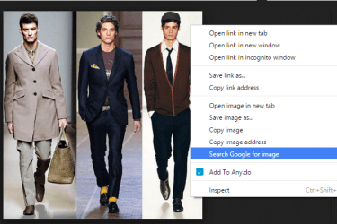
Hold S and right click an image to do reverse image search in Chrome.
Need a notepad in Chrome or Firefox?
data:text/HTML,%20<html%20contenteditable>
Copy and paste this into the address bar. You’ll open a new tab that you can write in. You can even save it.
We all know the struggles you face every time a video pops up on Facebook and it won’t stop without playing it fully!
Here’s the fix: navigate to facebook.com/settings. On the left side you’ll see ‘video’ – click on it and you’ll be presented with an option to turn off auto–play.
You are welcome!
You can turn off the iCloud notifications completely by doing the following steps:

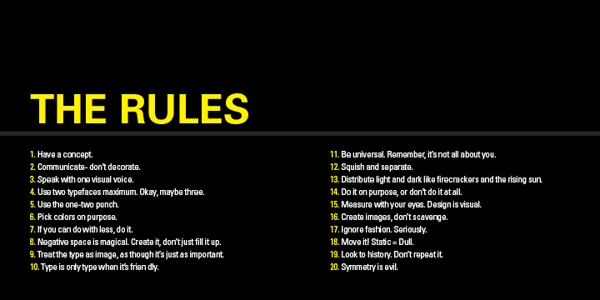
20 Rules for Good Design from Timothy Samara’s Book, “Graphic Design Elements.”
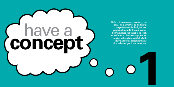
1 – HAVE A CONCEPT.
You need to begin with an idea. It may be very simple or neutral – “Itʼs important to organise this information to be easily navigable” – or it may be creatively contrived – “These biscuits will seem more delicious if they appear to be made by elves.” No idea = No design.
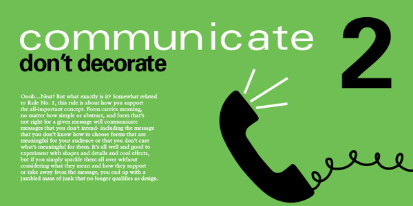
2 – COMMUNICATE – DON’T DECORATE.
Form. it is often said (not often enough, lately) follows function. This means two things. First – every dot, line, texture, shape, colour, and image should be related to the concept that must be conveyed (rule No. 1). Second, each of these forms should add to the concept. If the form is there solely because you think itʼs cool, you should probably get rid of it.
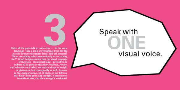
3 – SPEAK WITH ONE VISUAL VOICE.
All the parts of a project really should be recognisably related to each other on a visual level. That is, they must share some similar qualities in order to appear part of the same unified message.
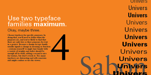
4 – USE TWO TYPEFACES – MAX.
Ok – maybe three…. no just two, typefaces only get you so far, even stylistically. Itʼs what you DO with the type that really says something. For hardcore, hierarchical concerns, one type family with a range of weights and widths should be enough.
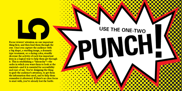
5 – SHOW ONE THING FIRST.
Hierarchy again…. Give visual emphasis to one item to grab the viewer’s attention. Then direct them – through a progression of size, weight, and colour changes, and so on – down the line of importance items or instructions. If they have to figure out what to look at first, they’ll get confused and leave or just throw what ever the item of communication is in the bin.
6 – PICK COLOURS FOR A PURPOSE.
As subjective as colour perception is, it’s shouldn’t be all guesswork. Colours mean things culturally, and colours have optical relationships to each other. Use these “factual” aspects to choose and combine colours in a meaningful way – and in an optically dynamic way.
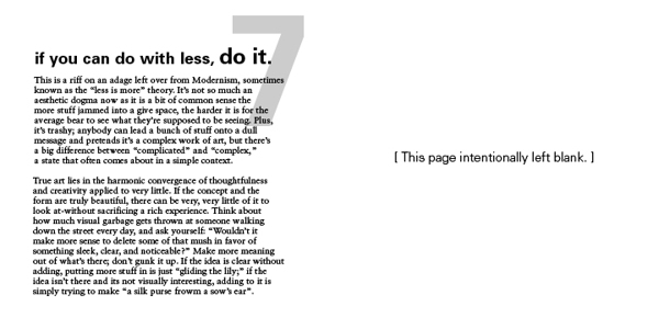
7 – IF YOU CAN DO WITH LESS, DO SO.
This is another way of saying “Less is more.” It’s about being economical: Try to show only what is necessary. If “necessary” can be pared down a bit, too, that’s a good thing. Think about how many messages, how many resources, how many annoying blobs of information the average viewer has to deal with on a regular basis (never mind the landfill). Now, design accordingly.
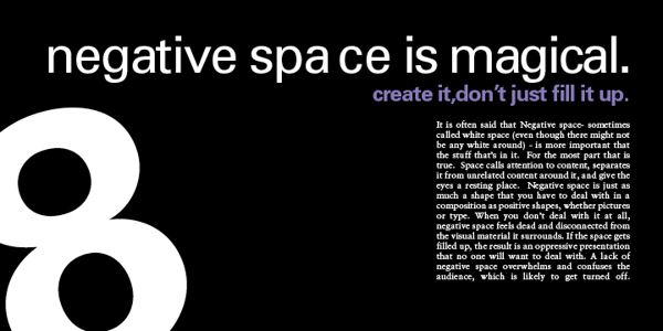
8 – NEGATIVE SPACE IS IMPORTANT: CREATE IT, DON’T FILL IT UP!
Despite the fact that the space in a format around the shapes and pictures and text is apparently empty, it’s really a shape unto itself. Consider it as carefully as you would anything that you plop into it. The better integrated the negative space and the more interesting it is, the stronger the composition.
9 – TREAT TYPE LIKE IMAGE.
This is one of the most difficult rules to master. Type actually is an image, even though it looks like something else. It must be considered for its visual qualities, relative to other image material, to integrate it into compositions – even more so when there’s a lot of it.
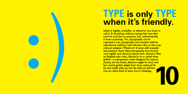
10 – KEEP TYPE FRIENDLY.
If it’s illegible, it’s not type. If it’s illegible it’s not type. And if itʼs illegible, itʼs not type. Consider the audience – their assumed level of education, their schedule, and especially their age – when choosing styles and sizes. Written language exists to transmit information, and your client is paying you to transmit such information on their behalf. If the information canʼt be read – for any reason – itʼs no longer useful, and youʼre potentially out of a job.
11 – BE UNIVERSAL, IT’S NOT ABOUT YOU.
If youʼre interested in expressing your fetishes or psychoses, become a painter (fine art not wall) and work the gallery scene (seriously – it can pay alot better). The purpose of design is populist in nature: you re creating clear messages for other people. The more understandable the images you make, the better.
12 – CREATE RHYTHMS.
The antidote to visual boredom is tension, and there are two easy ways to achieve this antidote: The first is by constantly varying the sizes, weights, and spaces among visual elements so that they appear to be constantly shifting and moving. And….
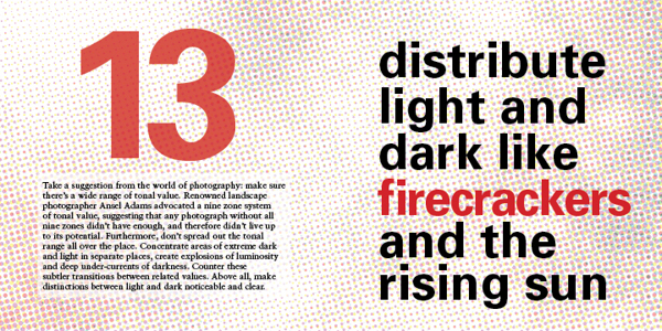
13- USE CONTRAST: DARK & LIGHT.
Radically vary the lightness and darkness in different areas of a composition, as well as the quality of dark and light values: Sharp and aggressive, fluid and murky, bold and clean…
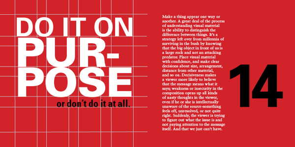
14 – BE DECISIVE: DO OR DON’T.
Avoid being wishy-washy in arranging things. Visual elements should be clearly one thing or another, one way or another. Ambiguity can be useful, but even this should be on purpose, not a sloppy by-product of indecision.
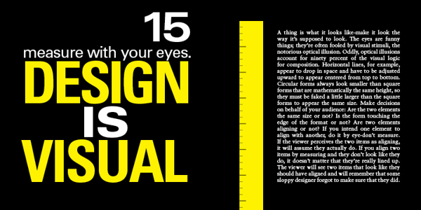
15 – MEASURE WITH YOUR EYES.
A majority of formal relationships play havoc with your eyes – for example, a solid dot and a square can appear to be different sizes if they are mathematically the same measure in height: circles appear to contract in a space because of their ill defined, endless contour.
All visual forms play off each other, so make them behave the way you want them to look like theyʼre behaving. Use your eyes: it usually will look better that way – and the more you do it the better you will get at it – like everything in life.
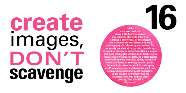
16 – CREATE YOUR OWN IMAGES.
Itʼs so much easier to find a stock photo and drop some type on top of it. But anyone can do that, and they do. At the very least, alter found images to transform them into the right images: customise for your client, customize for your audience.
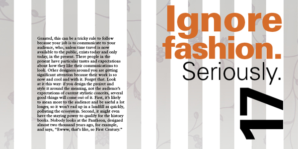
17 – TRY TO IGNORE FASHION. REALLY!
Whatʼs currently fashionable sells but can be forgotten very quickly. You might make some money, but how will you feel in the morning? And how will your contribution be remembered in 100 years? Keep the word timeless in your head, and make decisions based on concept, meaning, and function, not the latest, shallow trend. If you can…
18 – MOVE IT! STATIC EQUALS DULL.
Two-dimensional images that appear kinetic (in motion) attract greater attention and retain interest longer than those that seem tired, stiff, and lifeless. Arranging visual elements asymmetrically, with differing spatial intervals between them contrasting directional emphasis, creates the appearance of spatial depth and movement. Compose wisely.
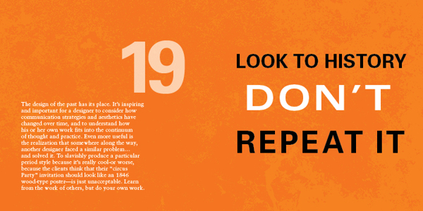
19 – LOOK TO HISTORY – DON”T REPEAT IT.
Much successful design borrows from past innovators, as does all human endeavors. That said, applying oneʼs understanding of how a famous work achieves its goal and ripping it off are two completely different things. Show some respect… but donʼt cross the line between flattery and forgery.
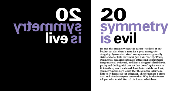
20 – SYMMETRY IS THE ULTIMATE EVIL.
Symmetrically organised material creates repetitive, static spatial intervals, violating rule No.18. Furthermore, symmetry relies on an understood truth about a format – that it has a center – and so it offers nothing new to the viewer





CAUTION:
If you import a backup file to a database that already has content, it will replace the existing content.
You should get a message like this:Import has been successfully finished, X queries executed.
If you instead receive an error, please try the command line method below.
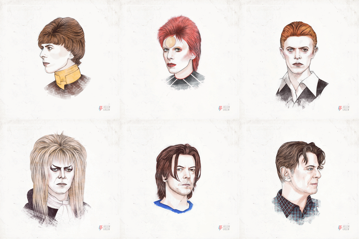
David Bowie – This is a bit late but happy birthday!
Helen Green: 50 years of hairstyles
David Bowie – David Robert Jones (8 January 1947 – 10 January 2016), known professionally as David Bowie (/ˈboʊi/), was an English singer, songwriter and actor. He was a figure in popular music for over five decades, regarded by critics and musicians as an innovator, particularly for his work in the 1970s. His career was marked by reinvention and visual presentation, his music and stagecraft significantly influencing popular music. During his lifetime, his record sales, estimated at 140 million worldwide, made him one of the world’s best-selling music artists. In the UK, he was awarded nine platinum album certifications, eleven gold and eight silver, releasing eleven number-one albums. In the US, he received five platinum and seven gold certifications. He was inducted into the Rock and Roll Hall of Fame in 1996.
Born in Brixton, South London, Bowie developed an interest in music as a child, eventually studying art, music and design before embarking on a professional career as a musician in 1963. “Space Oddity” became his first top-five entry on the UK Singles Chart after its release in July 1969. After a period of experimentation, he re-emerged in 1972 during the glam rock era with his flamboyant and androgynous alter ego Ziggy Stardust. The character was spearheaded by the success of his single “Starman” and album The Rise and Fall of Ziggy Stardust and the Spiders from Mars, which won him widespread popularity.
In 1975, Bowie’s style shifted radically towards a sound he characterised as “plastic soul”, initially alienating many of his UK devotees but garnering him his first major US crossover success with the number-one single “Fame” and the album Young Americans. In 1976, Bowie starred in the cult film The Man Who Fell to Earth and released Station to Station. The following year, he further confounded musical expectations with the electronic-inflected album Low (1977). It was the first of three collaborations with Brian Eno that would come to be known as the “Berlin Trilogy”. “Heroes” (1977) and Lodger (1979) followed; each album reached the UK top five and received lasting critical praise.
After uneven commercial success in the late 1970s, Bowie had UK number ones with the 1980 single “Ashes to Ashes”, its parent album Scary Monsters and Super Creeps, and “Under Pressure”, a 1981 collaboration with Queen. He then reached his commercial peak in 1983 with Let’s Dance, with its title track topping both UK and US charts.
Throughout the 1990s and 2000s, Bowie continued to experiment with musical styles, including industrial and jungle.
He also continued acting; his roles included Major Celliers in Merry Christmas, Mr. Lawrence (1983), the Goblin King Jareth in Labyrinth (1986), Pontius Pilate in The Last Temptation of Christ (1988), and Nikola Tesla in The Prestige (2006). He also appeared in other films, did television appearances and cameos too.
He stopped concert touring after 2004, and his last live performance was at a charity event in 2006. In 2013, Bowie returned from a decade-long recording hiatus with the release of The Next Day. He remained musically active until he died of liver cancer two days after the release of his final album, Blackstar (2016).
Load the Google CHrome app named Styler:
https://chrome.google.com/webstore/detail/styler/bogdgcfoocbajfkjjolkmcdcnnellpkb?utm_source=chrome-app-launcher-info-dialog
Then go to the page with the bad font.
Click on the Styler S icon on the top right of Chrome.
Copy and paste the code below with the font you want to change:
Helvetica Neue for example:
@font-face { font-family: ‘helvetica neue’; src: local(‘Arial’); }
All done.
CSS can be very useful but sometimes it can’t be used. In situations like this, the Japanese double space can be used instead. Use the code   if you want to add a double space the same size as one Japanese character.
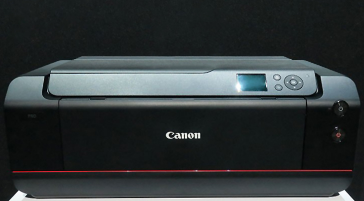
Canon has just announced the 12 ink ImagePROGRAF Pro-1000 17″ printer. You should be able to see it at PhotoPlus in New York City on October 21st.
Fingers crossed that it can print business card paper stock. More information coming soon.
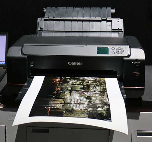
Looks like the border problems have been fixed when printing on thin pieces of paper. This printer will rock having 12 colors and being able to print on business card sized pieces of paper.
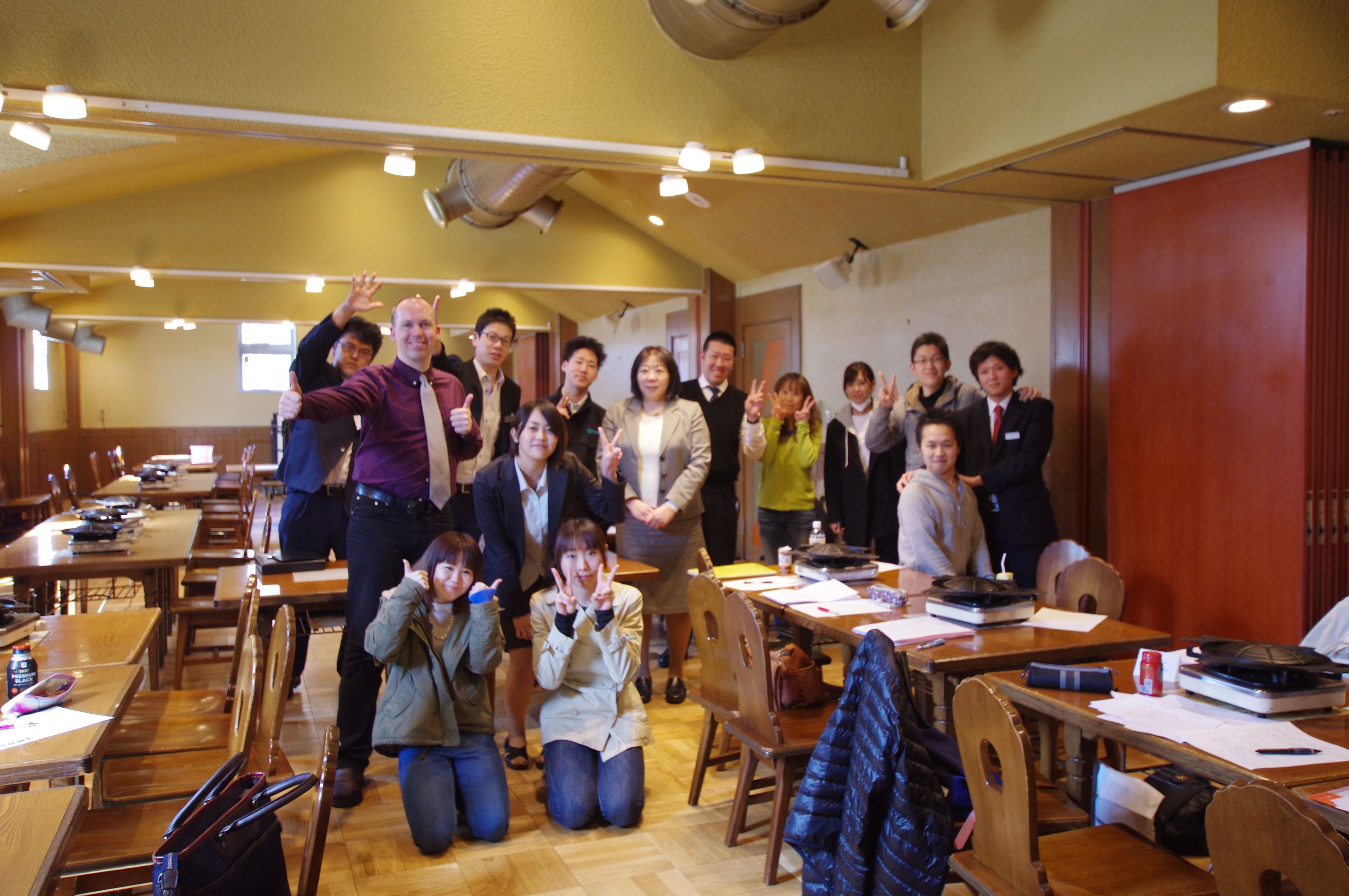
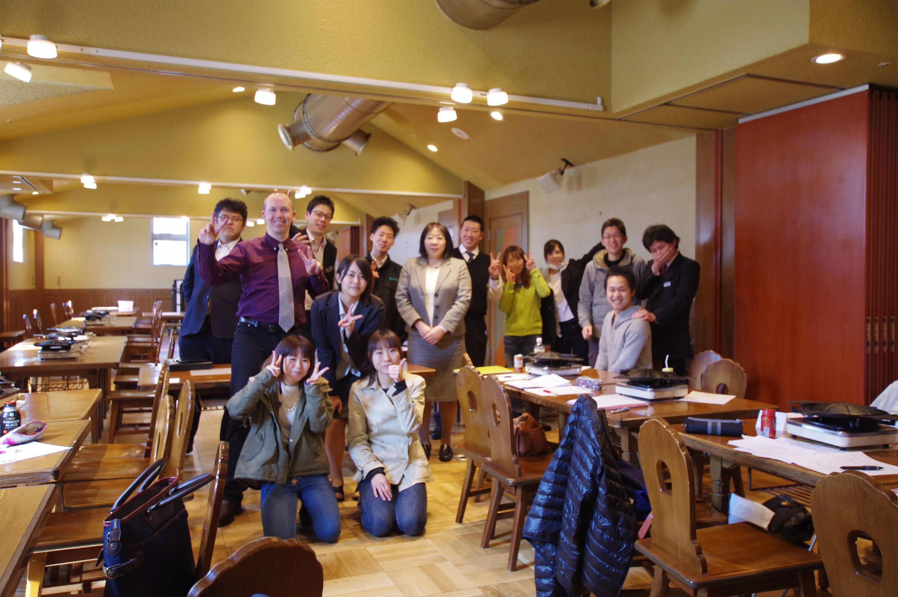

Sapporo Beer Garden
皆様へ
ありがとうございました。
Thank you very much for studying English with me at the Sapporo Beer Garden.
いつでも質問があれば、メールまたはライン電話またはフェースブックで話しましょう。
If you have any questions, let’s talk on Line, Facebook or by email.
暇な時間があれば、一緒に飲みましょう。
Let’s go drinking sometime ^^
Please add me on Line and/or Facebook ★
ライン電話 ID:glencharlesrowell
フェースブック:Glen Charles Rowell
Eメール:このページ
A: Hello. (Welcome to Sapporo Beer Garden)
B: Hi.
A: How many people?
B: 3.
A: Smoking or non-smoking?
B: Non-smoking please.
A: Certainly. This way please.
B: Okay.
A: Is this table okay?
B: Yes. Thank you.
A: I’ll just get a menu for you.
B: Okay. Thank you.
A: Would you like to order drinks separately or have the all-you-can-drink plan tonight?
B: How much is the all-you-can-drink plan?
A: It’s ______ yen for 90 minutes. Last order is at 9:30pm.
( _______ yen for ____ minutes.)
B: We’ll just have beer thank you.
A: Which beer would you like?
One _____ and two _____s please.
A: Okay, and would you like anything to eat?
B: I need a bit of time to look at the menu.
A: Okay. When you are ready to order you can order from ___ in the hall.
B: Okay. Thank you.
A: Hello. How many people?
B: I have a reservation for two.
A: What was the reservation name?
B: Glen Charles Rowell.
A: How do you spell Rowell?
B: R-O-W-E-L-L.
A: Okay, thank you. This way please.
Is this table all right?
B: Yes, thank you.
B: Excuse me!
A: Yes.
B: I’d like to order now.
A: Certainly. What would you like to order?
B: Can I have the ___________ salad please?
A: Certainly.
Which salad dressing would you like?
B: What types of dressing do you have?
A: We have A, B _______ C.
B: Which do you recommend?
A: The ___________ dressing is very popular.
B: Okay, I’ll have that.
A: Okay. Thank you.
Would you like anything else (to order)?
B: No, thank you.
A: Okay. Thank you.
B: Excuse me!
A: Yes.
B: What’s the time now?
A: It’s 7:30.
B: Okay. Thank you.
A: Would you like another drink?
B: No thank you.
A: Okay.
A: Hello. That comes to __________ yen please.
B: Okay. Here you are.
A: Would you like a receipt?
B: No thank you.
A: Okay. Thank you for coming tonight.
Have a great night.
B: Thank you.
A: See you. (Smile and bow/wave)
| ジンギスカン・焼き野菜セット | Jingisukan and Vegetables |
| トラディショナルジンギスカン・焼き野菜セット | Frozen Lamb Jingisukan and Vegetables |
| トラディショナルジンギスカンお肉のみ | Frozen Lamb Jingisukan Only |
| 生ラムジンギスカン・焼き野菜セット | Fresh Lamb Jingisukan and Vegetables |
| 生ラムジンギスカンお肉のみ | Fresh Lamb Jingisukan Only |
| ラム肩ロースジンギスカン・焼き野菜セット | Lamb Shoulder Jingisukan and Vegetables |
| ラム肩ロースジンギスカンお肉のみ | Lamb Shoulder Jingisukan Only |
| チョイス グリルメニュー | Grilled Food |
| ラムタンロール | Lamb Tongue Roll |
| 漬込みジンギスカン | Marinated Jingisukan |
| 道産 鶏のジンギスカン | Chicken Jingisukan |
| 道産 豚のジンギスカン | Pork Jingisukan |
| 焼き野菜 | Mixed Vegetables |
| チョイス シーフードメニュー | Seafood |
| ズワイガニ | Snow Crab |
| タラバガニ | King Crab |
| カニの盛り合わせ | Crab Platter |
| ホタテ | One Scallop |
| エビ | One Shrimp Five Shrimp |
| 鮭 | Salmon |
| イカ | Squid |
| シーフードの盛り合わせ | Seafood Platter |
| サラダ | Salad |
| グリーンサラダ | Green Vegetable Salad |
| 桜姫鶏のシーザーサラダ 温泉玉子添え | Sakurahime Chicken Caeser Salad with Onsen Egg |
| Slow-boiled Egg with Soft Egg White | |
| おつまみ | Relish |
| カマンベール・ガーリックチーズの盛り合わせ | Camembert and Garlic Cheese Platter |
| 北海道産生ハム | Fresh Ham from Hokkaido |
| スモークサーモン | Smoked Salmon |
| 中札内産枝豆 | Green Soybeans from Nakasatsunai |
| ザワークラウト | Sauerkraut (Sour Cabbage) |
| 道産ポテト | Hokkaido Potato |
| フライポテト | French Fries |
| バターポテト | Butter Potato |
| ポテトグラタン | Potato Gratin |
| ソーセージ | Sausage |
| 道産豚のフランク | Pork Sausage |
| ぐるぐるラムソーセージ | Rolled Lamb Sausage |
| ソーセージの盛り合わせ | Sausage Platter |
| 一品料理 | A la carte |
| イカの一夜干し 炙り焼 | Grilled Squid |
| シーフードガーリックライス | Garlic and Seafood Rice |
| カニクリームコロッケ | Crab Cream Croquette |
| 道産鶏のザンギ | Chicken from Hokkaido Fried Zangi Style |
| オニオンリングタワー(大) | Onion Ring Tower (Large) |
| オニオンリングタワー(小) | Onion Ring Tower (Small) |
| ライス・トースト・お漬物 | Rice ・ Toast & Pickled |
| ライス | Rice |
| ライス(大盛) | Rice (Large) |
| ゴマ塩おにぎり | Rice Balls with Sesame and Salt |
| 白菜キムチ | Chinese Cabbage Kimchi |
| ガーリックトースト | Toasted Garlic Bread |
| デザート | Dessert |
| 牛乳プリン | Milk Pudding |
| ビール園特製アイスクリーム | Beer Garden Special Ice Cream |
| ハスカップシャーベット | Haskap Sherbet |
| サッポロ生ビール 黒ラベル〈樽生〉 | Sapporo Draft Beer |
| 大ジョッキ | Large |
| 中ジョッキ | Medium |
| 小ジョッキ | Small |
| グラス | By the Glass |
| ハーフ&ハーフ | Half & Half |
| 北海道限定 生ビール | Draft Beer Available Only in Hokkaido |
| 北海道限定クラシック生 ・ ジョッキ | Sapporo Classic Draft Beer |
| サッポロプレミアム生ビール | Sapporo Premium Draft Beer |
| ヱビス生 ・ ジョッキ | Yebisu Draft Beer |
| ヱビスプレミアムブラック ・ ジョッキ | Yebisu Premium Black Beer |
| サッポロファイブスター | Sapporo Five Star Draft Beer |
| ノンアルコール サッポロプレミアムアルコールフリー | Non Alcohol – Sapporo Premium Alcohol Free Beer |
| サッポロ氷彩サワー ・ カクテル ・ その他 | Sapporo Hyosai Sour, Cocktails and Liquor |
| レモンサワー | Lemon Sour |
| グレープフルーツサワー | Grapefruit Sour |
| 巨峰サワー | Kyoho Grape Sour |
| 男梅サワー | Plum Sour |
| ウーロン茶割り | Shochu and Oolong Tea |
| カシスオレンジ | Cassis Orange |
| カシスソーダ | Cassis Soda |
| カシスウーロン | Lemon Oolong Tea |
| バカルディ モヒート | Bacardi Mojito |
| 梅酒 | Plum Liquor |
| ゆず酒 | Yuzu Liquor |
| ワイン | Wine |
| 北海道ツヴァイゲルト・レーベ | Hokkaido Zweigeltrebe ~Red~ |
| 北海道ケルナー | Hokkaido Kerner ~White~ |
| サッポロポレールスタンダード | Sapporo Polaire Standard ~Red ・ White~ |
| オルディナ | Oldina ~Red ・ White~ |
| ウイスキー・日本酒・焼酎 | Whisky, Sake & Shochu |
| ☆スコッチ | Scotch Whisky |
| デュワーズ ホワイト・ラベル | Dewer’s White Label |
| ☆日本酒 | Sake |
| 本醸造 辛口生酒北の誉 | Honjozo Dry Kita no Homare |
| 寒造り北の誉 | Kanzukuri Kita no Homare |
| ☆焼酎 | Shochu |
| 芋焼酎 | Karariimo Shochu |
| 麦焼酎 | Waramugi Shochu |
| ソフトドリンク | Soft Drinks |
| 100%オレンジ | Orange Juice |
| ウーロン茶 | Oolong Tea |
| コカ・コーラ | Coca-cola |
| ジンジャーエール | Ginger Ale |
| メロンソーダ | Melon Soda |
| りんご | Apple Juice |
| 山ぶどう | Wild Grape |
| ナポリン | Naporin Soda |
| Thank you for your time and studying English with me. I hope this drink list comes in useful. Have a wonderful day and hope to see you again in the future. Regards, Glen Charles Rowell | |
| May I help you? | |
| Are you ready to order? | |
| Would you like me to take a picture (for you)? | |
| Do you have a reservation? | |
| You can pay at the register over there. | |
| Is this table okay? | |
| Here’s your menu. | |
| Here you are. | |
| Thank you for coming here today. Have a great day. |
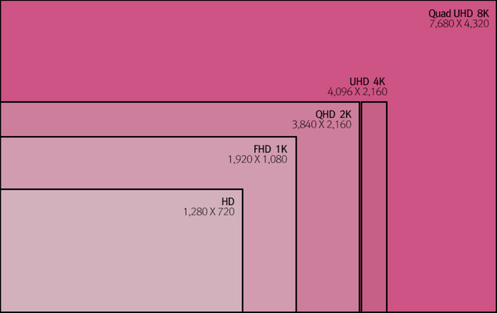
Looking for a new 8k monitor? The race is on as Dell’s 8K monitor might make it to stores before the 8K iMac can be seen. Apple’s 8K monitor looks like it is going to be produced by LG with new backlighting leds to reduce the amount of power the hungry iDisplay needs. Let’s hope Dell can do the same.
Both will be using the DisplayPort 1.3 connection to make full use of the bandwidth.
| External connector (source-side) on PCB | |||
| Pin 1 | ML_Lane 0 (p) | Lane 0 (positive) | |
|---|---|---|---|
| Pin 2 | GND | Ground | |
| Pin 3 | ML_Lane 0 (n) | Lane 0 (negative) | |
| Pin 4 | ML_Lane 1 (p) | Lane 1 (positive) | |
| Pin 5 | GND | Ground | |
| Pin 6 | ML_Lane 1 (n) | Lane 1 (negative) | |
| Pin 7 | ML_Lane 2 (p) | Lane 2 (positive) | |
| Pin 8 | GND | Ground | |
| Pin 9 | ML_Lane 2 (n) | Lane 2 (negative) | |
| Pin 10 | ML_Lane 3 (p) | Lane 3 (positive) | |
| Pin 11 | GND | Ground | |
| Pin 12 | ML_Lane 3 (n) | Lane 3 (negative) | |
| Pin 13 | CONFIG1 | connected to Ground1) | |
| Pin 14 | CONFIG2 | connected to Ground1) | |
| Pin 15 | AUX CH (p) | Auxiliary Channel (positive) | |
| Pin 16 | GND | Ground | |
| Pin 17 | AUX CH (n) | Auxiliary Channel (negative) | |
| Pin 18 | Hot Plug | Hot Plug Detect | |
| Pin 19 | Return | Return for Power | |
| Pin 20 | DP_PWR | Power for connector (3.3 V 500 mA) | |
# Pins 13 and 14 may either be directly connected to ground or connected to ground through a pulldown device.
|
|||